In Production
The full story is being crafted right now. Check back soon — or write to us and we'll show you what's coming.
A selection of concept work built with our own method.
New work in this category is in production.
Check back soon, or get in touch to see what's coming.
More case studies are in production — this selection grows with every new chapter.
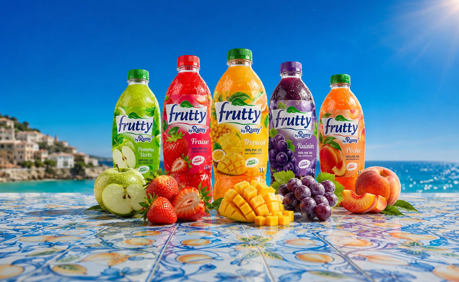
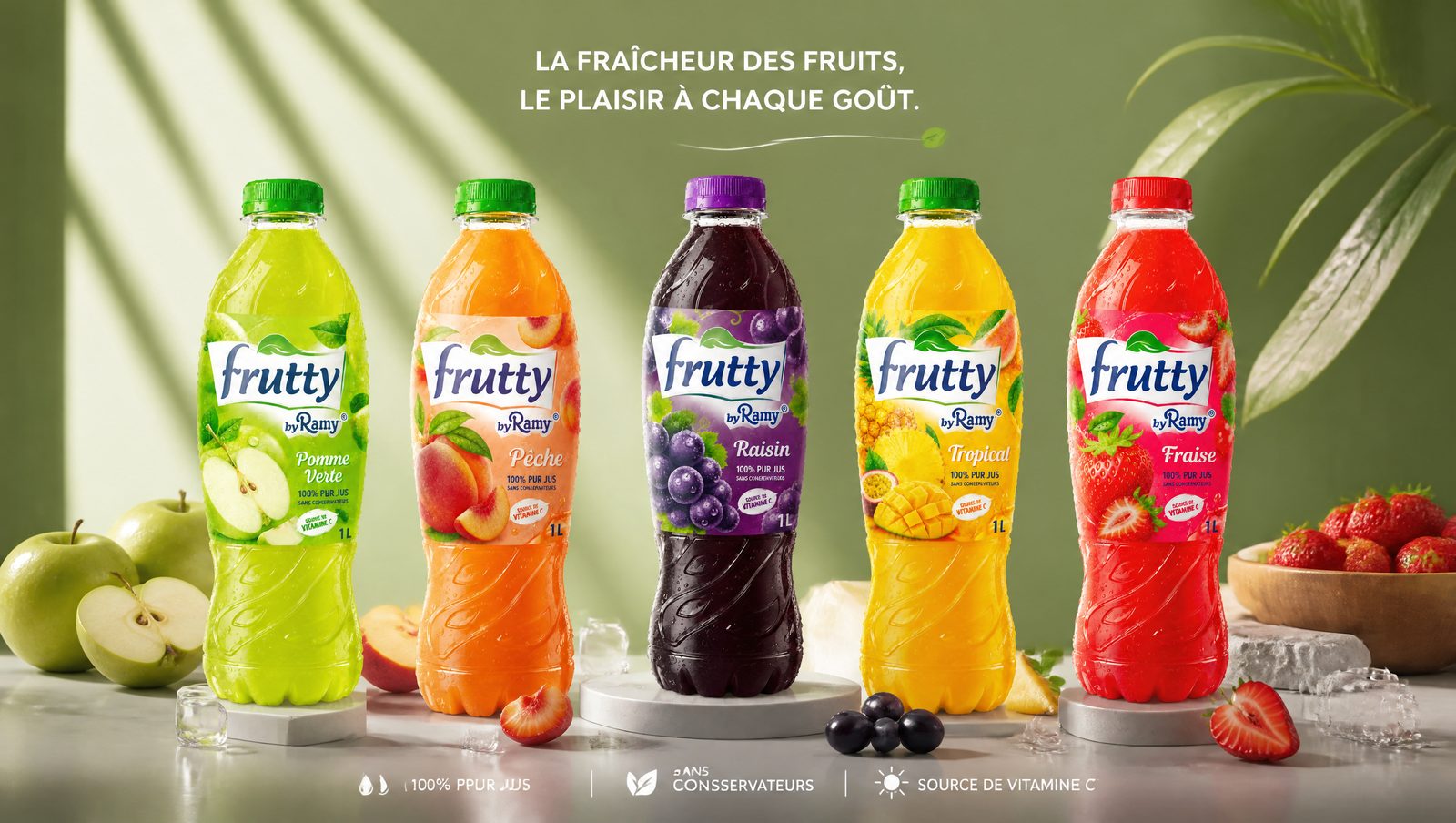
Fruit at its loudest — a brand that tastes as good as it looks, built to own the shelf.
The world. Bright color, splash, orchard light — a universe that smells like summer and makes you thirsty. Five flavors, one unmistakable family.
The making. From the logo to the pack system, the photomontage art direction and a splash series per flavor — the full identity, built from scratch.
Five flavors.
One family.
Splash, texture and color — every visual built to make you thirsty, including the cover.
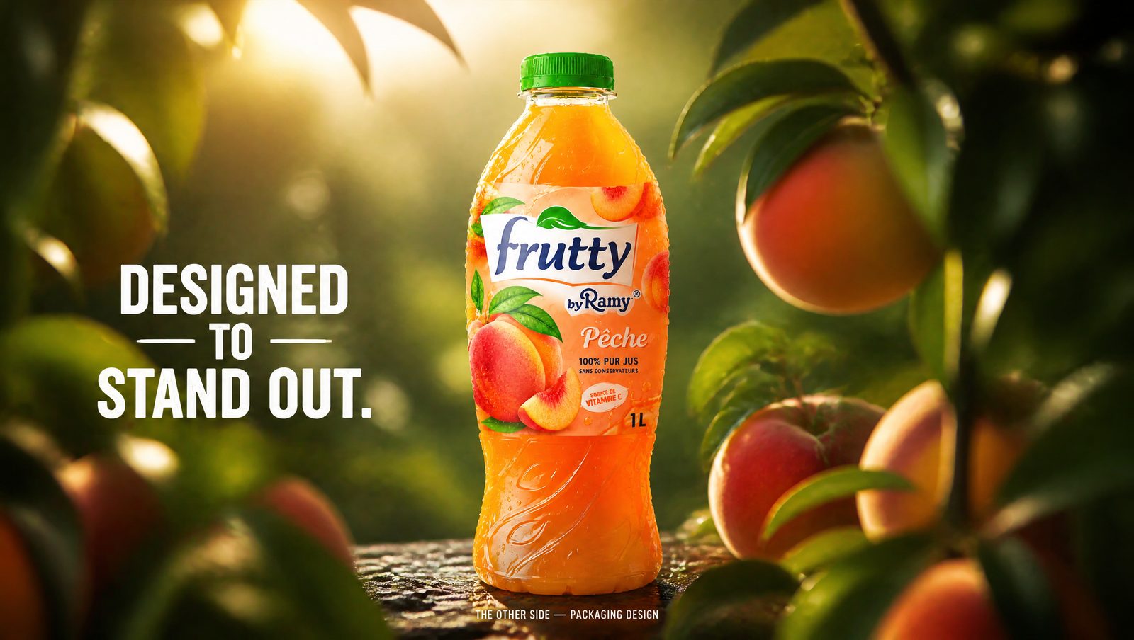
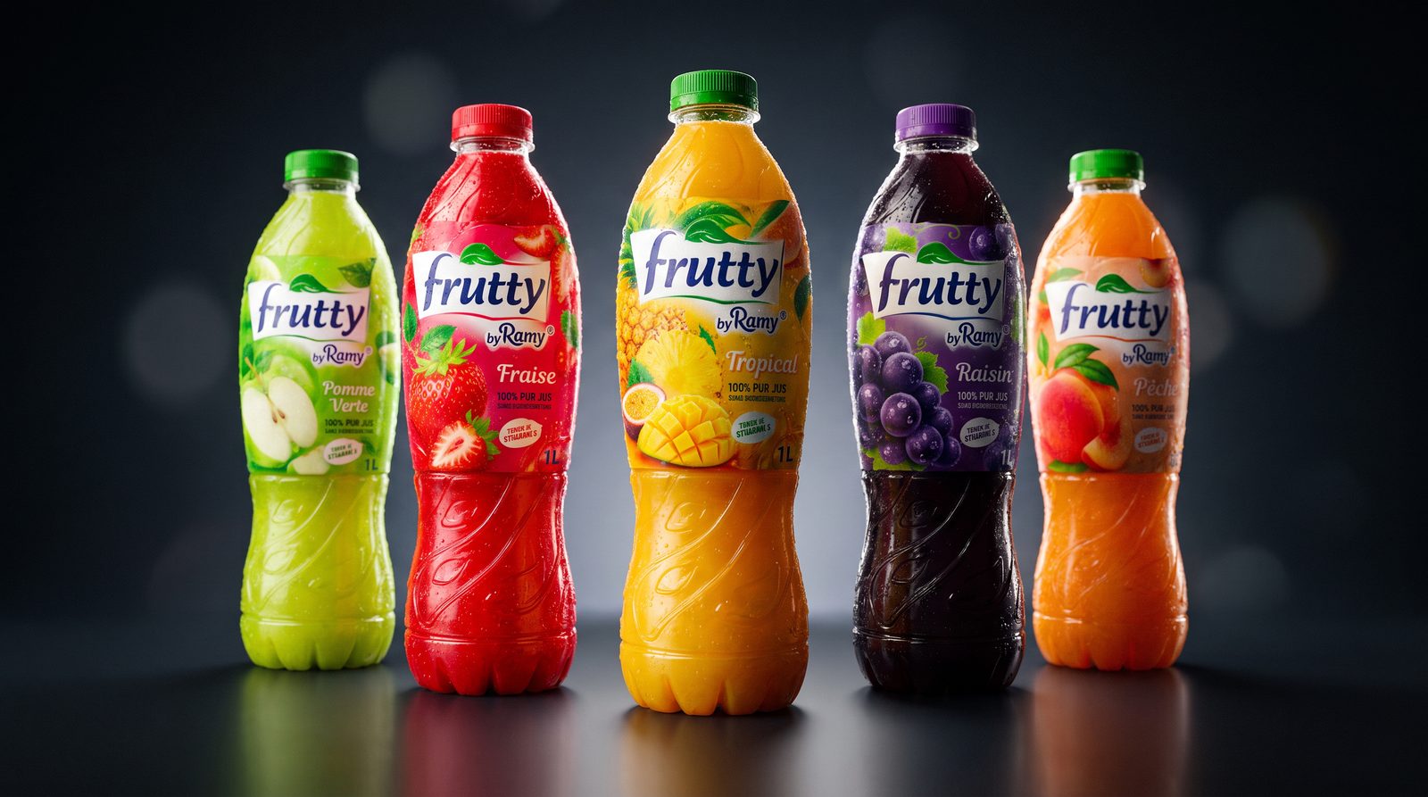
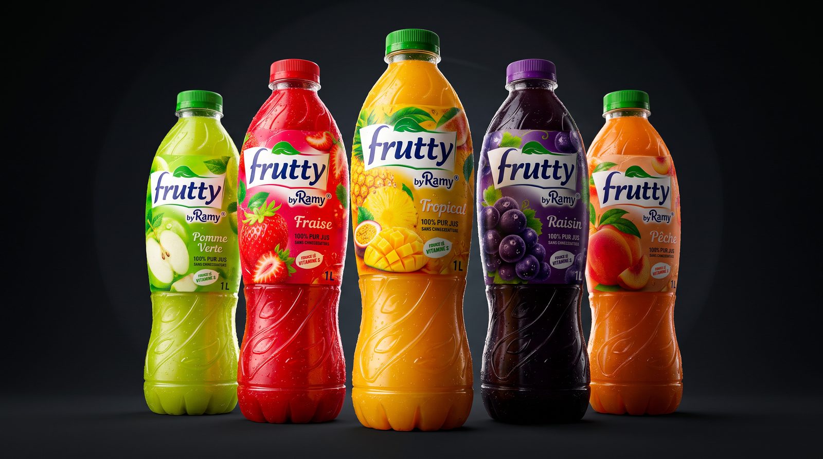
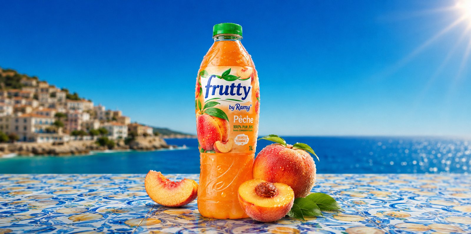
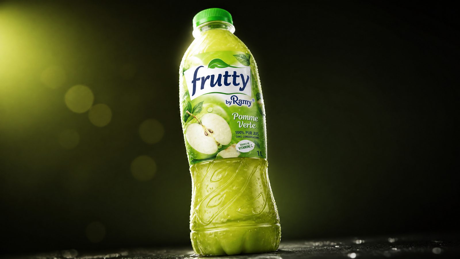
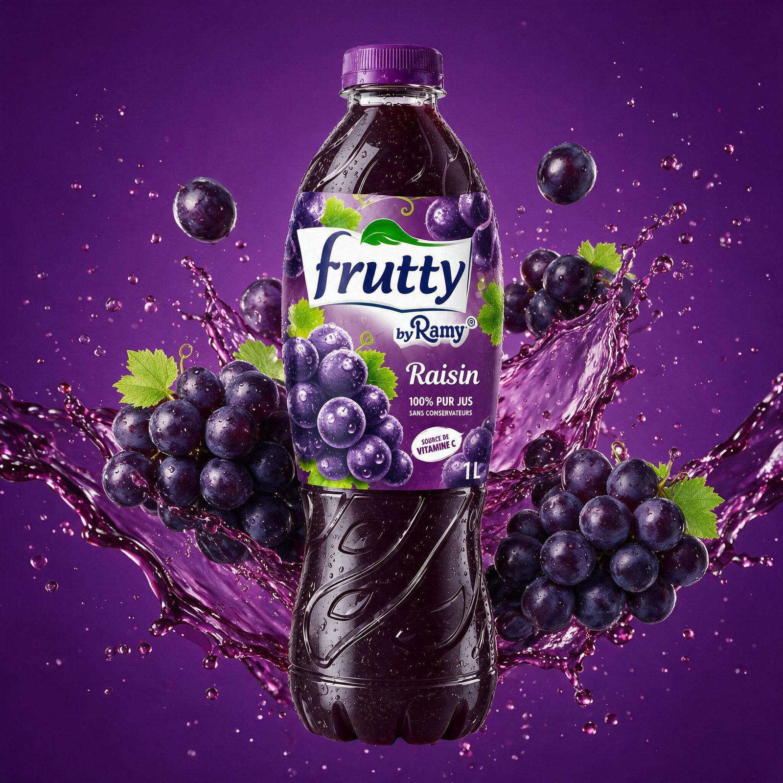
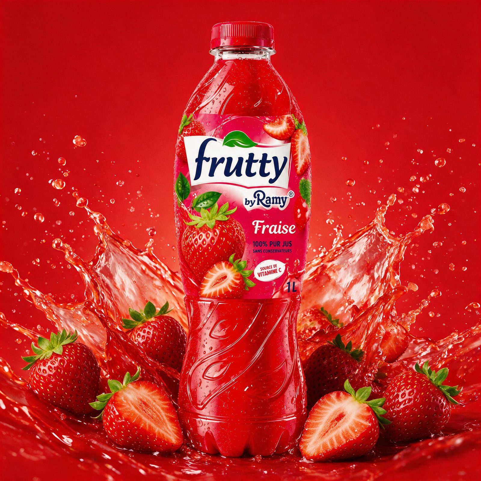
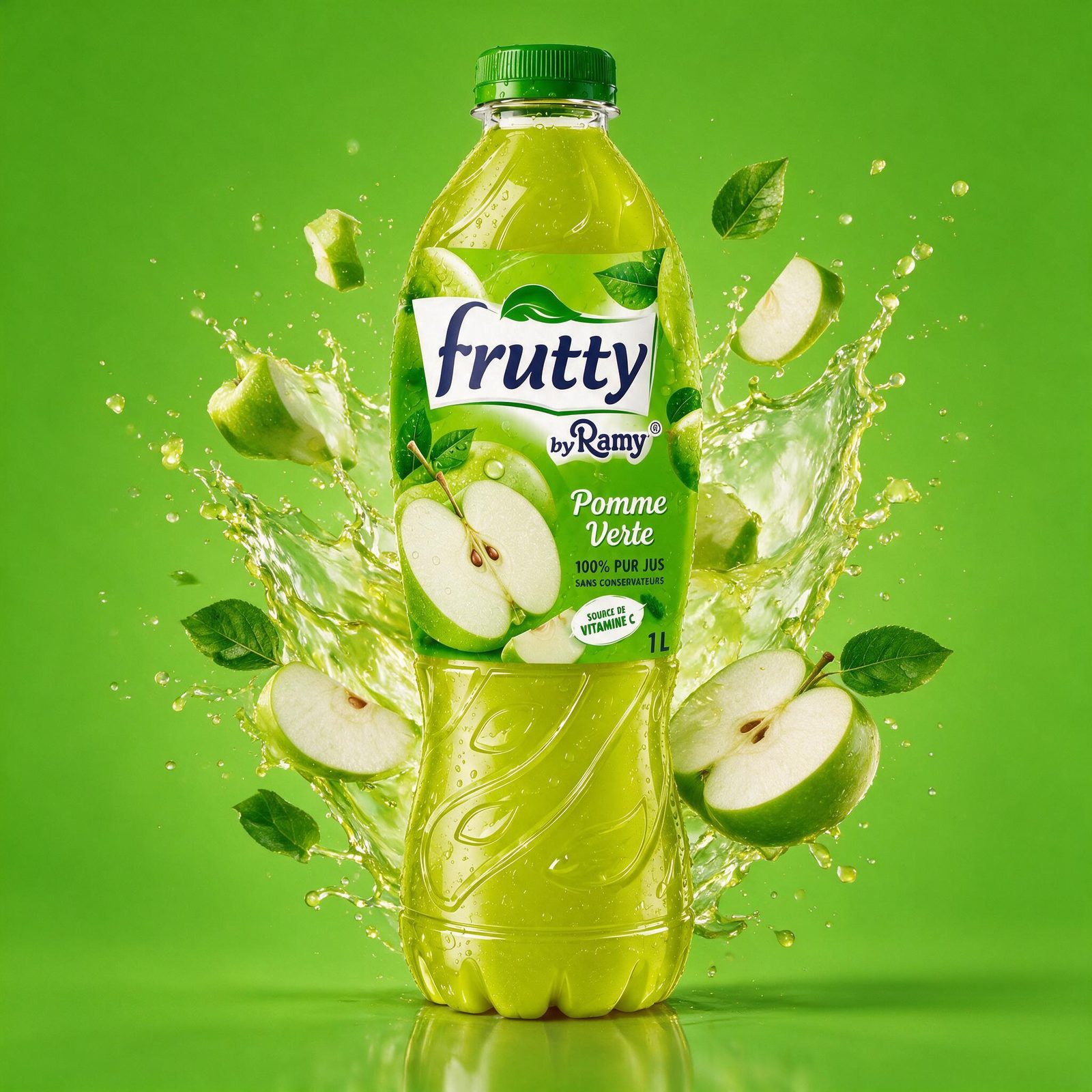
One system, five personalities — each pack owns its flavor while the family stays unmistakable.
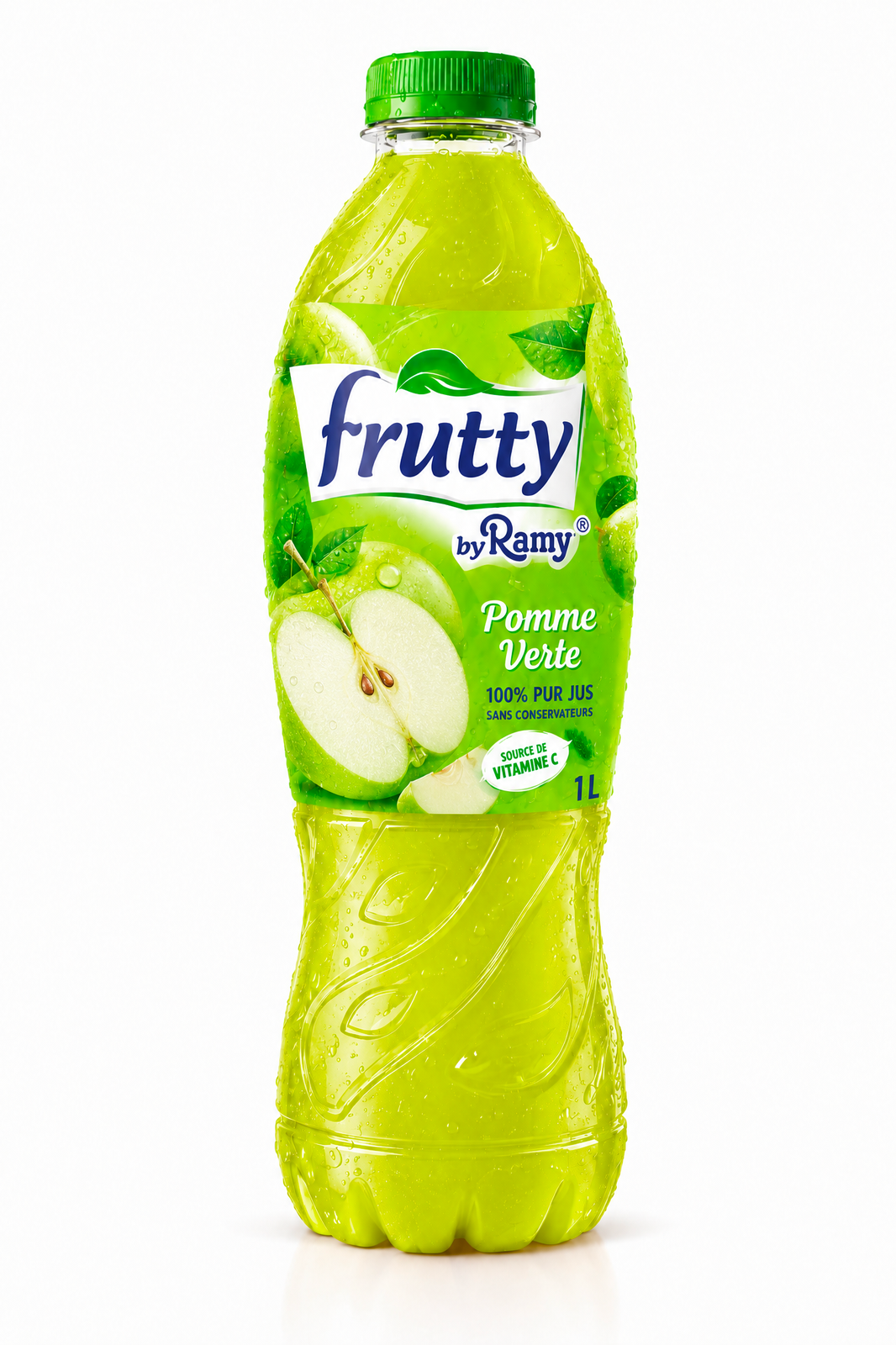
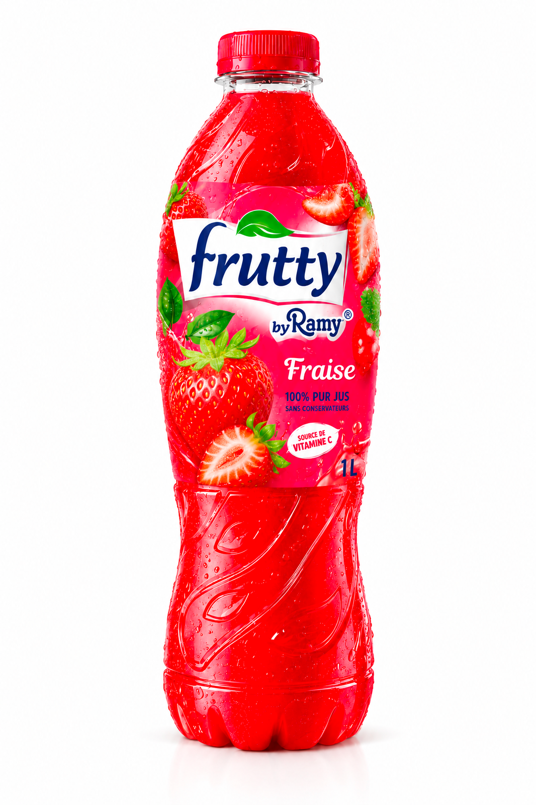
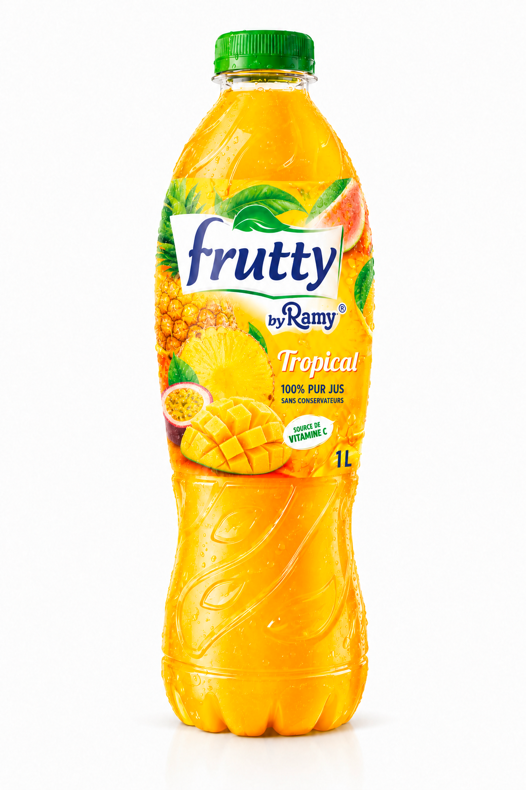
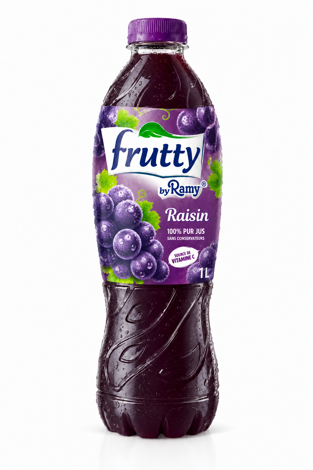
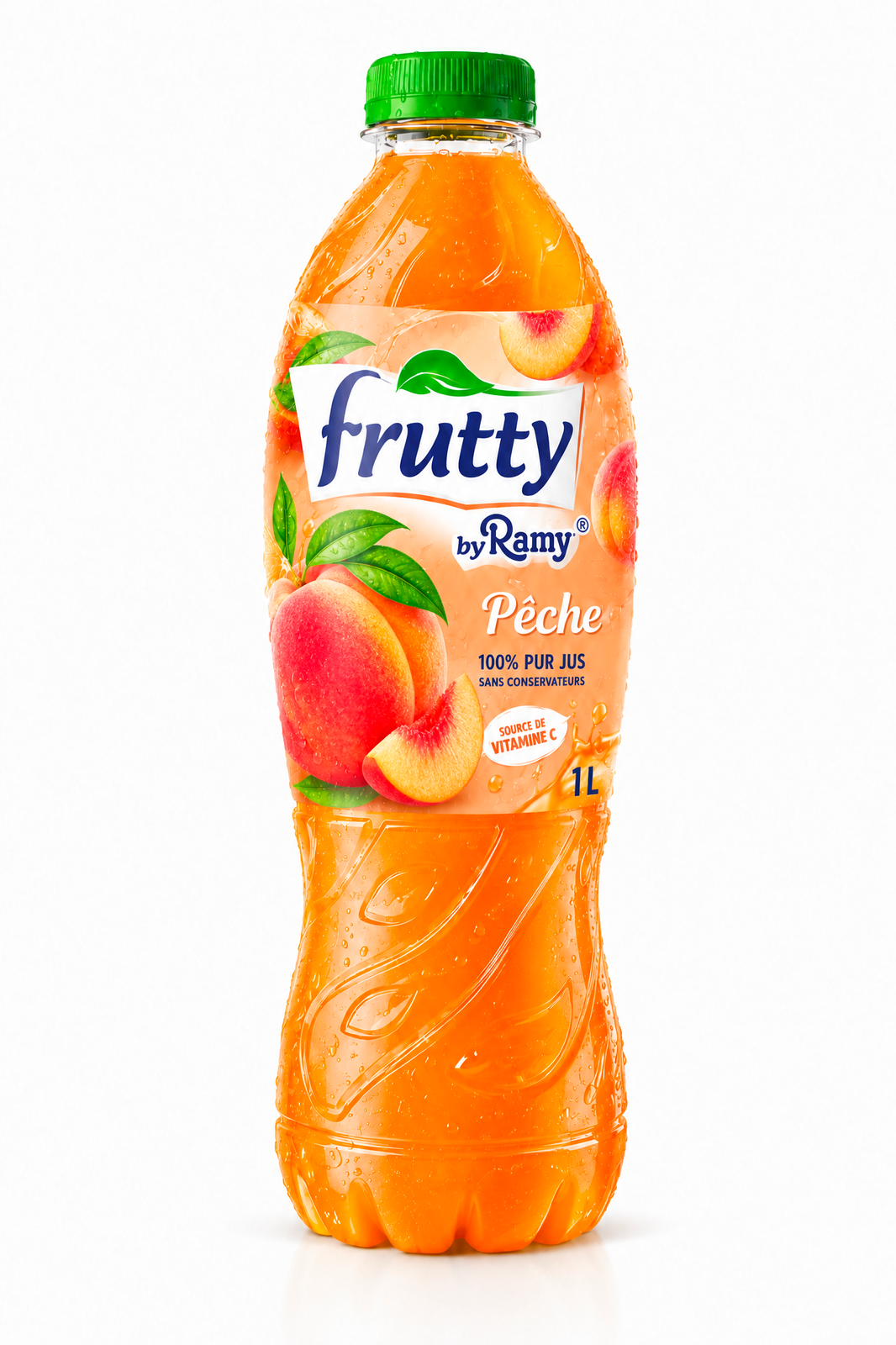
A system designed to read as a family — and stop the eye mid-aisle.
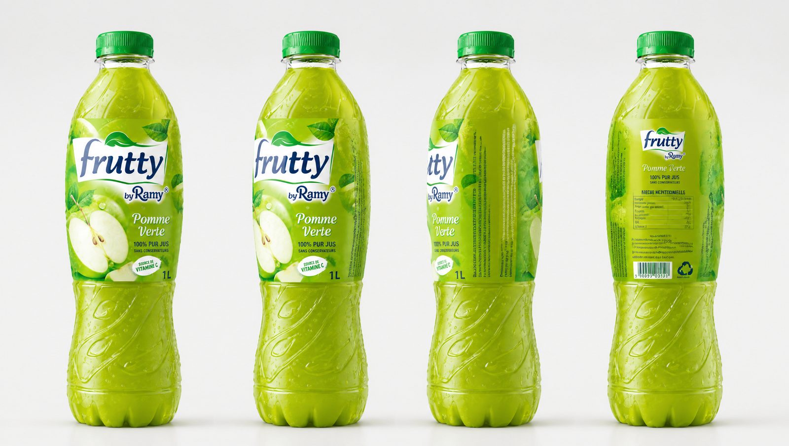
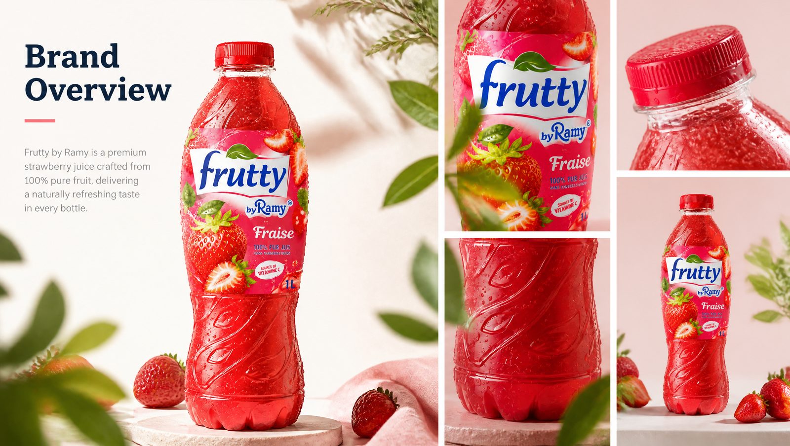
Mockups, commercials and orchard light — the brand living its best life, everywhere.
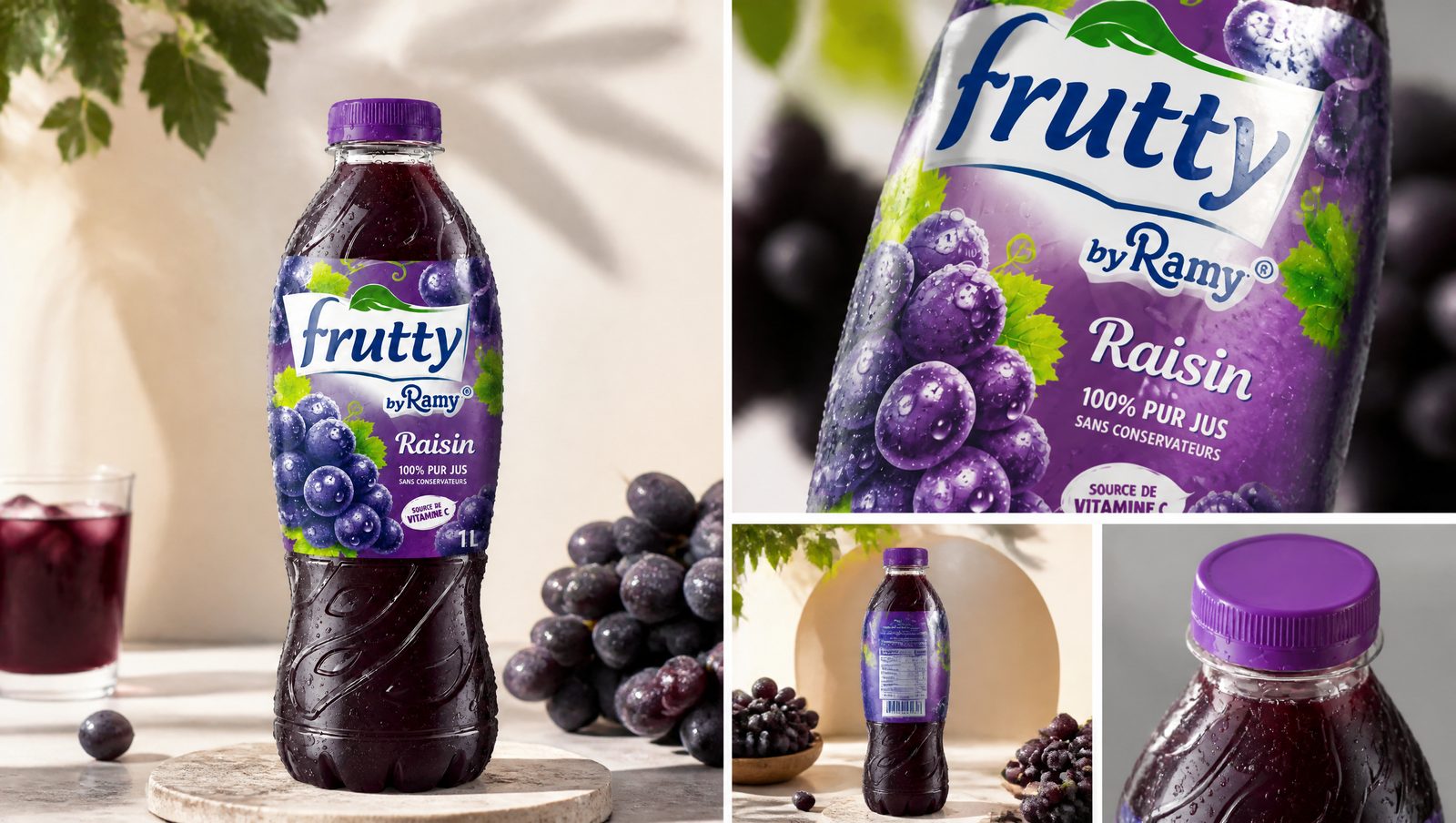
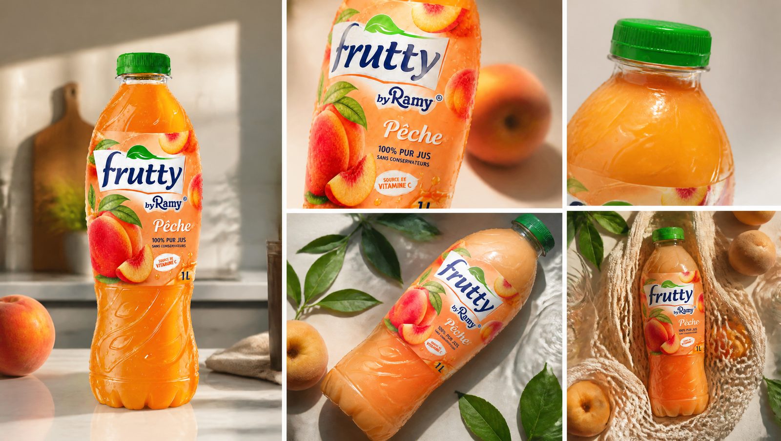
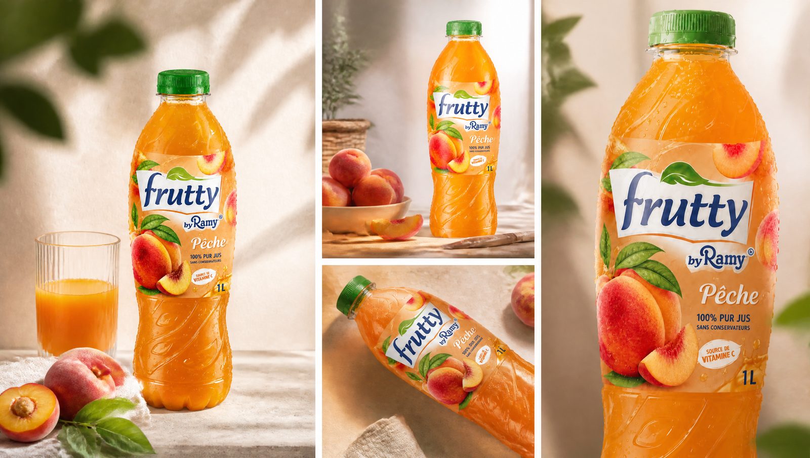
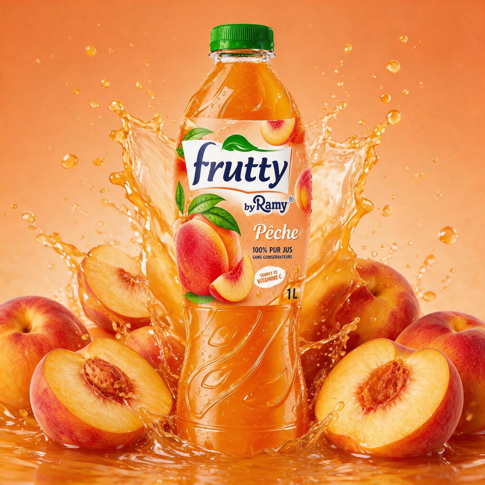
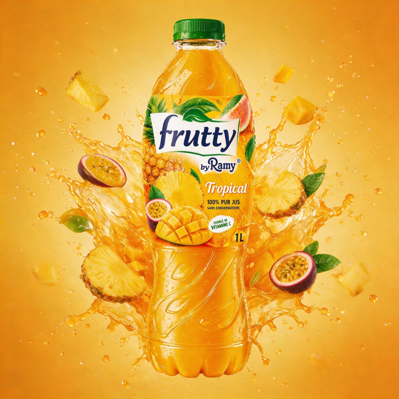
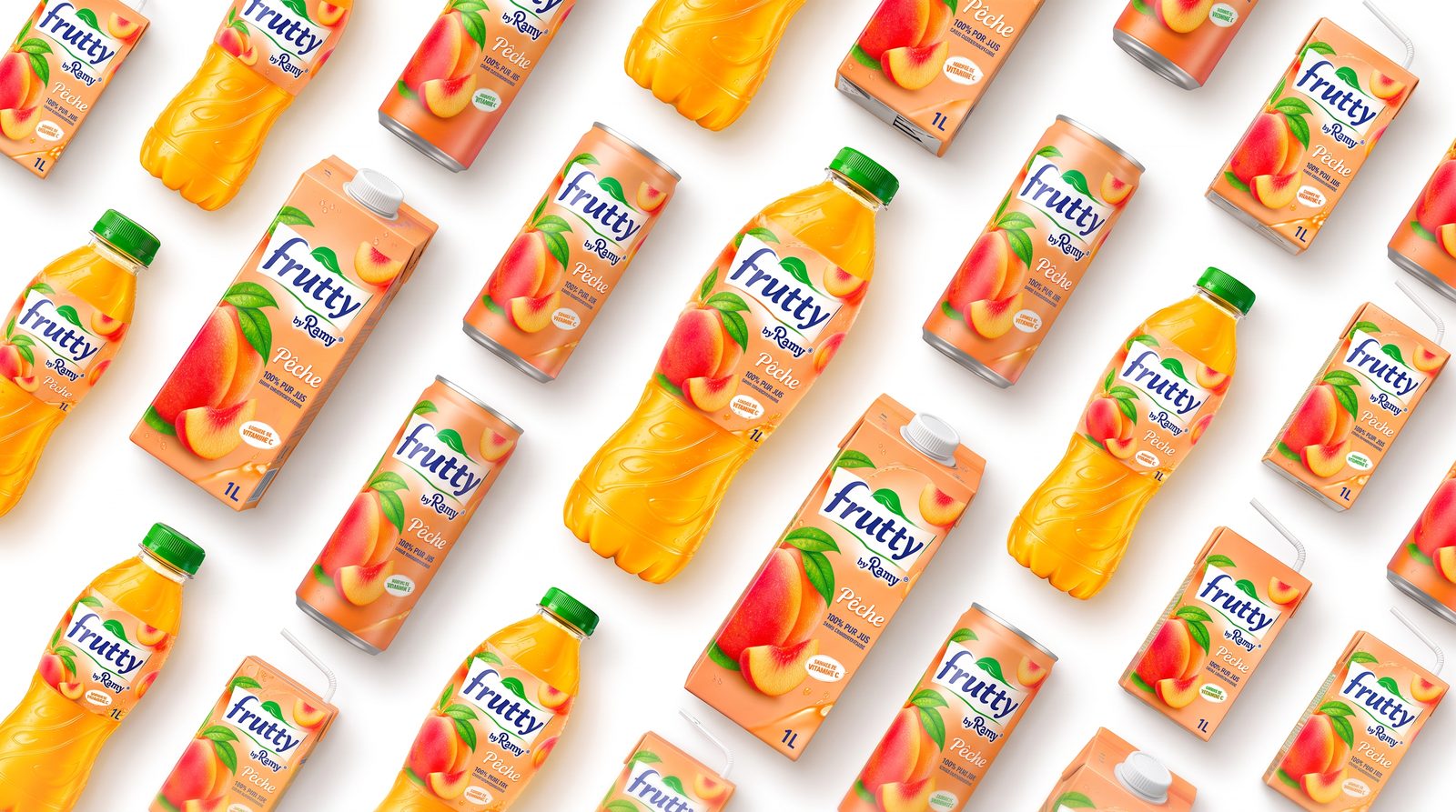
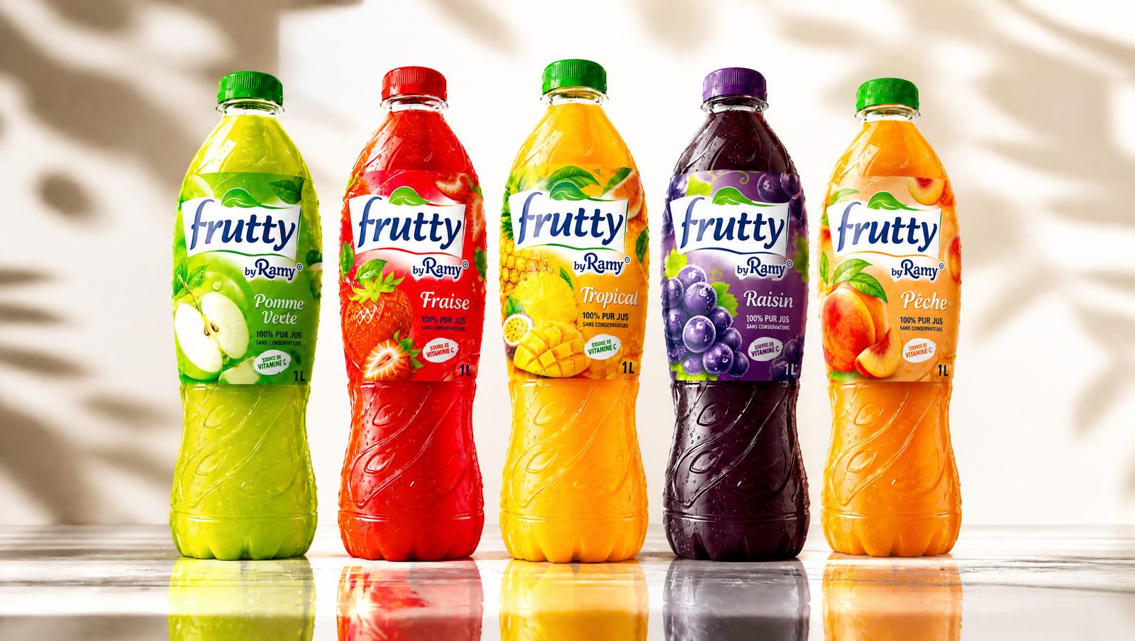
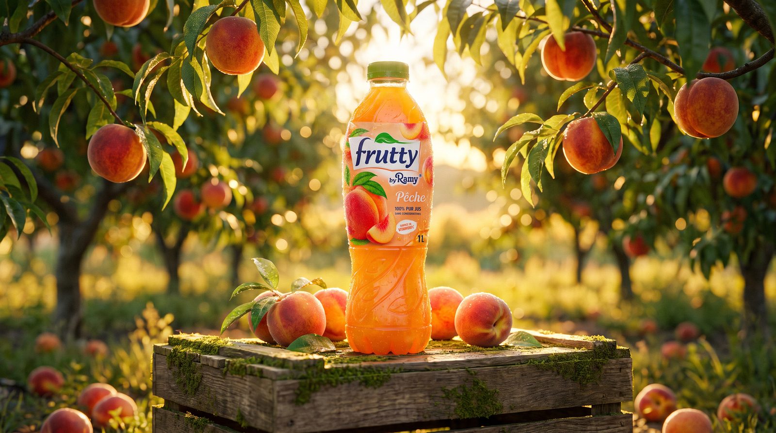
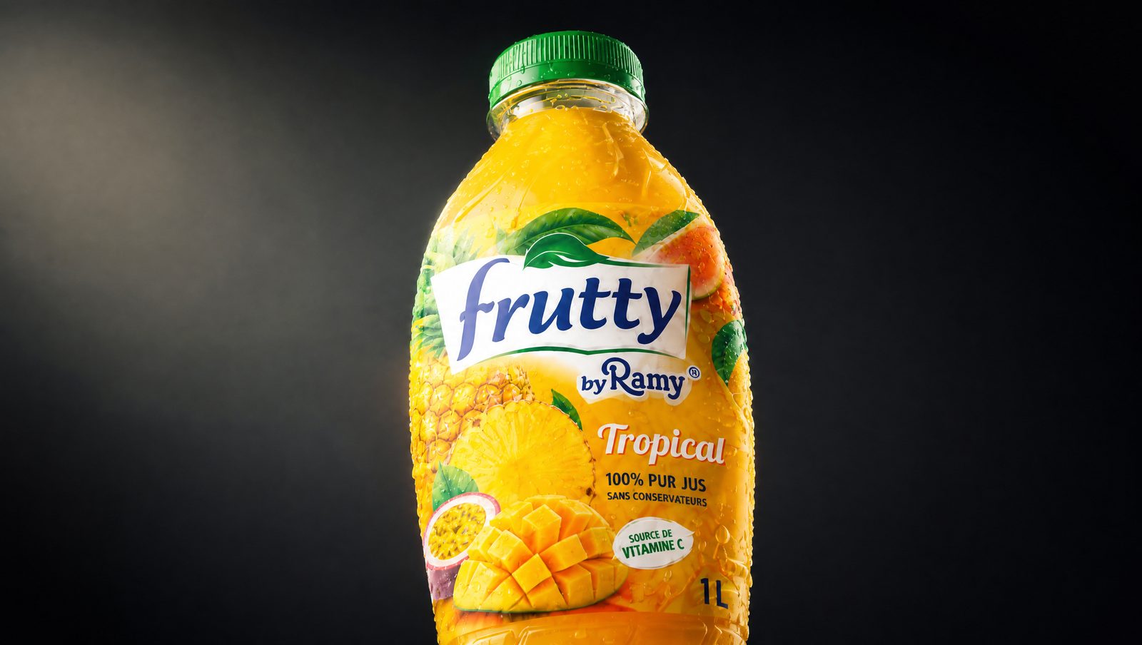
A color-coded splash language — each flavor gets its own explosion.
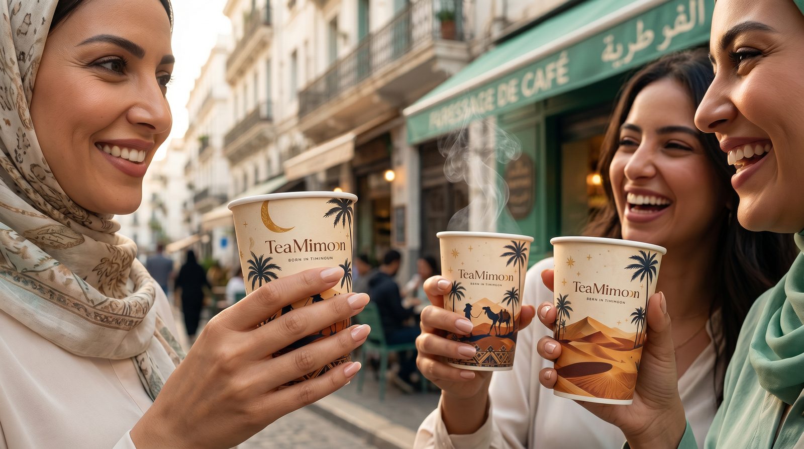
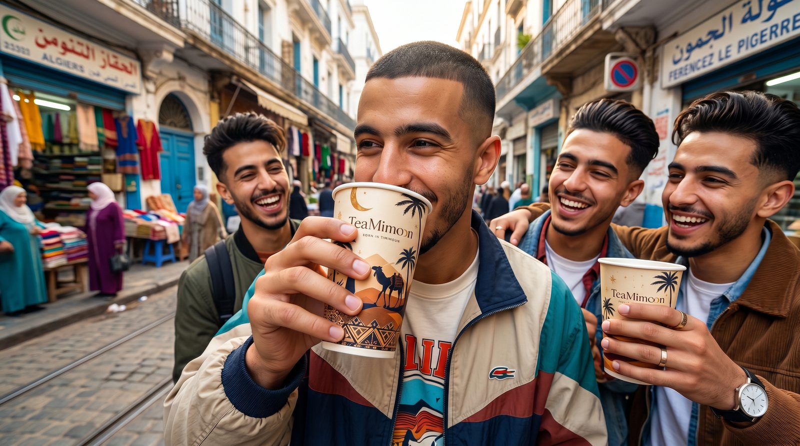
Tea for people who slow down — premium, calm, deliberately crafted.
The world. TeaMoon lives in the pause: soft light, warm textures, slow gestures. Tea as a ritual, not a routine.
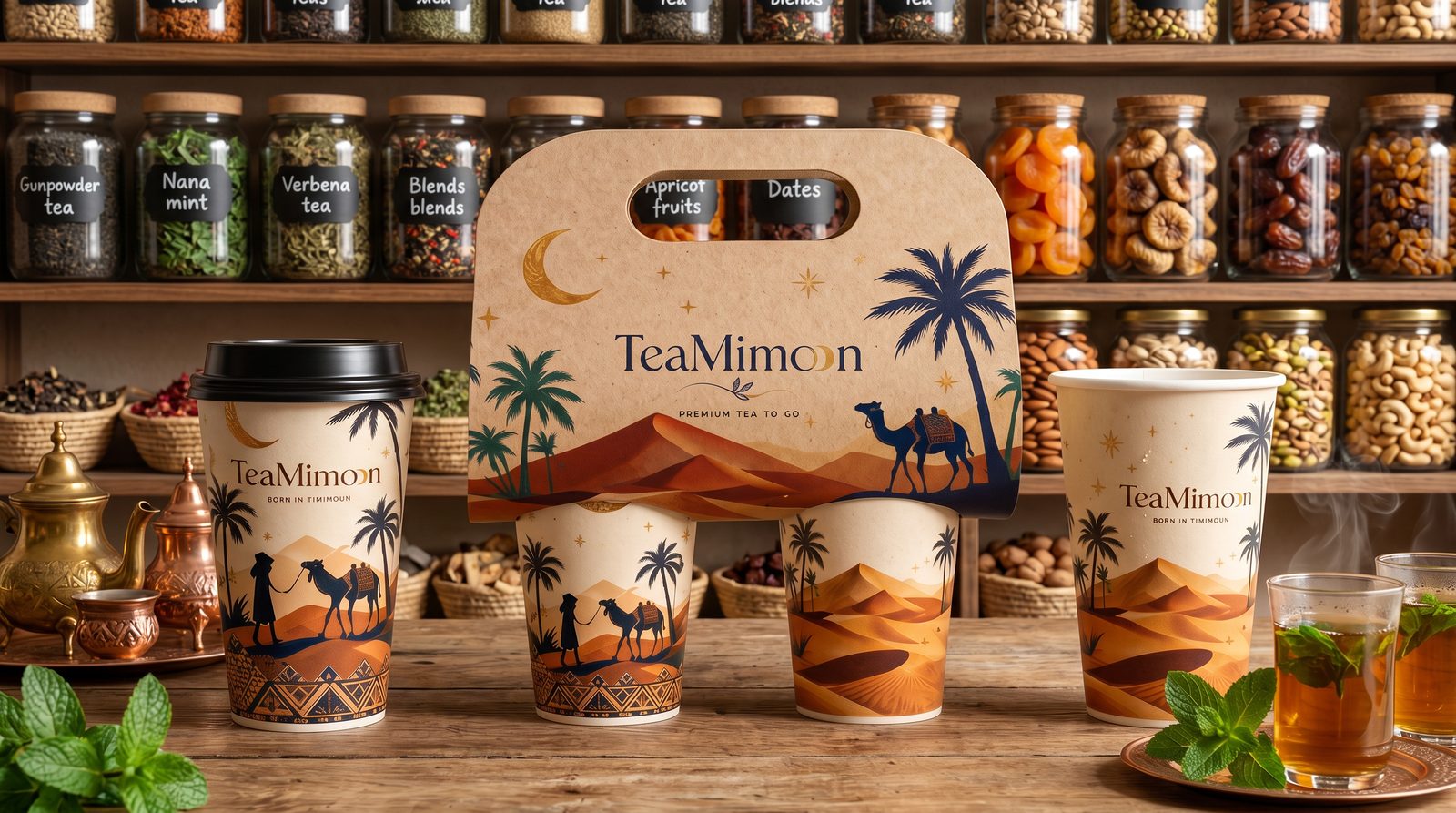
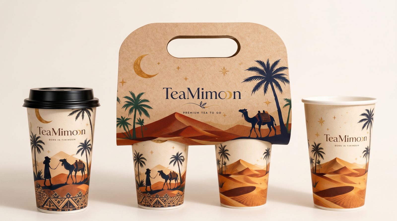
The making. We rebuilt the identity from scratch — refined logo, earthy palette, typography, guidelines, packaging and a coherent lifestyle direction.
Every cup,
a quiet moment.
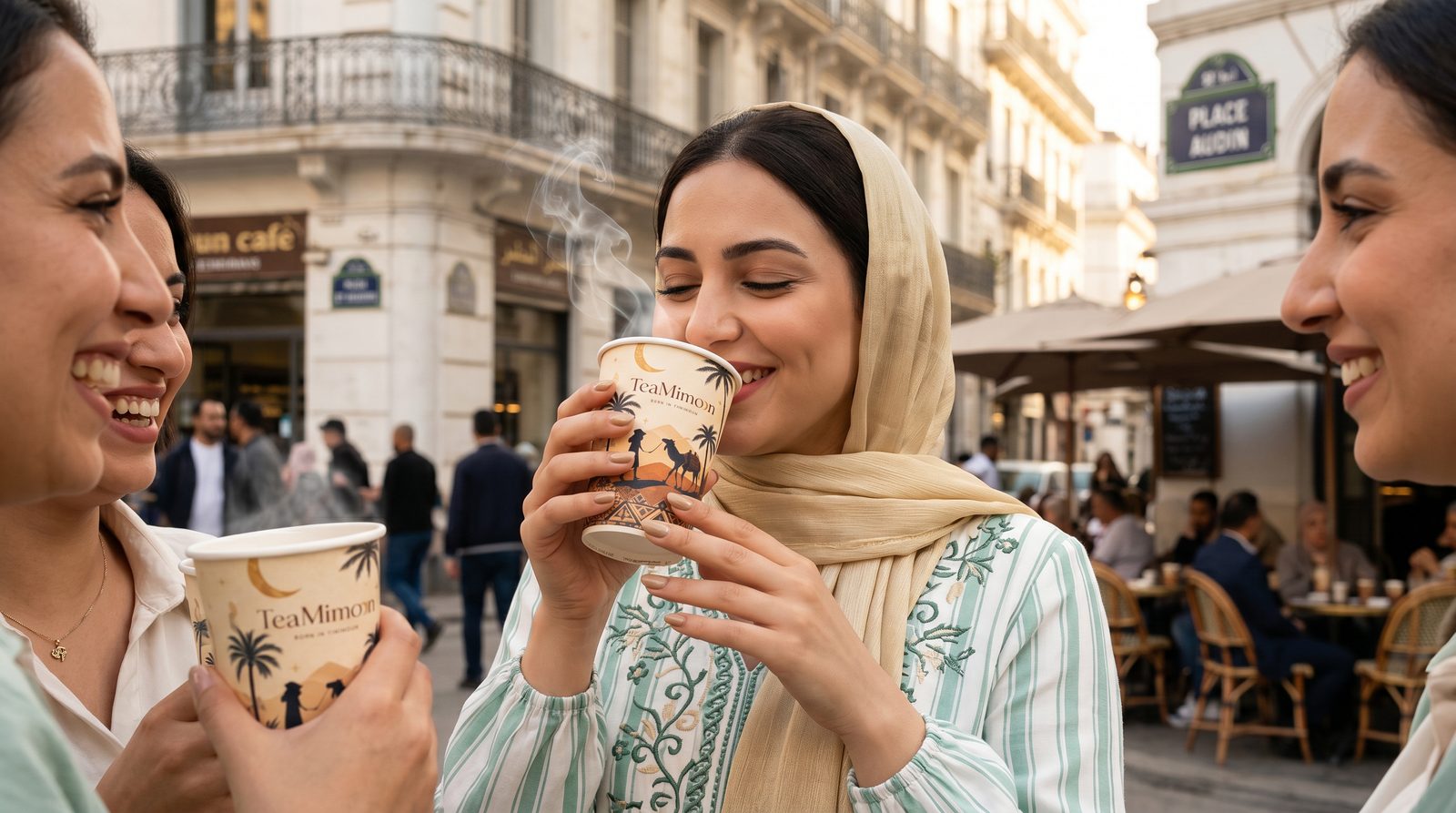
Real people, real pauses — the brand living in calm, everyday moments, cover included.
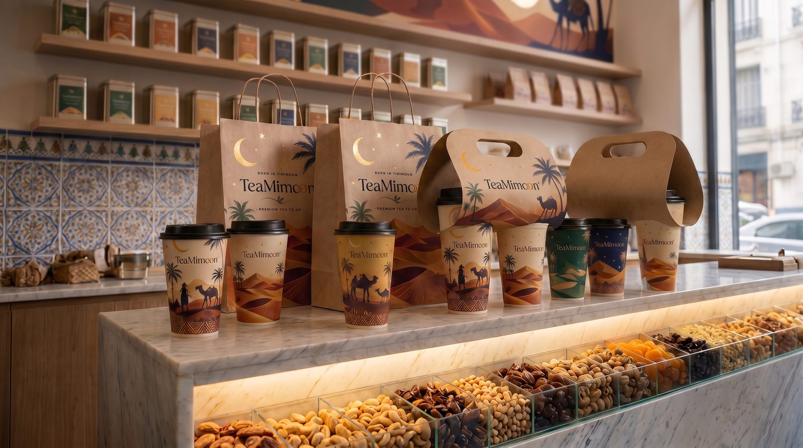
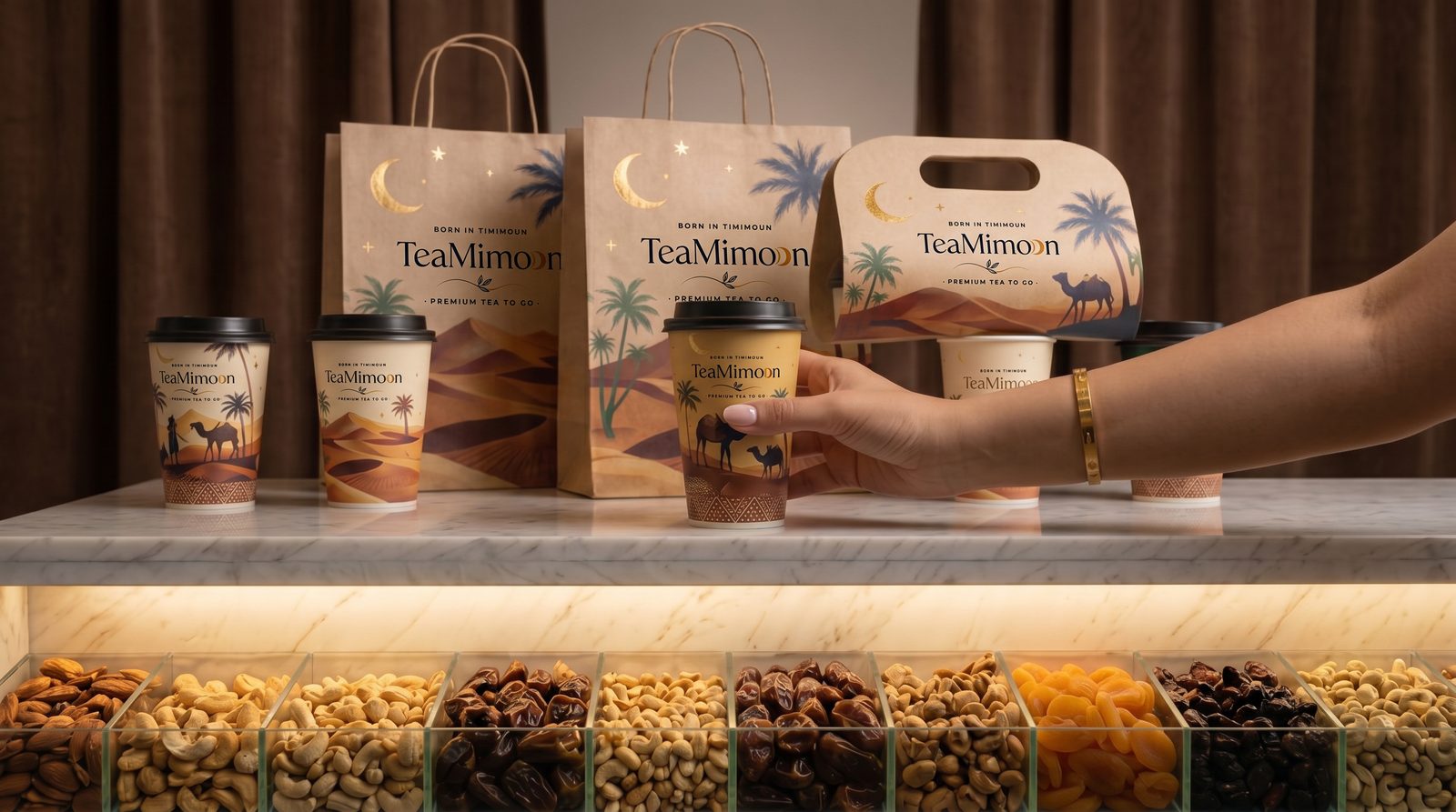
Logo, color and typography — a system with the same composure as the brand itself.
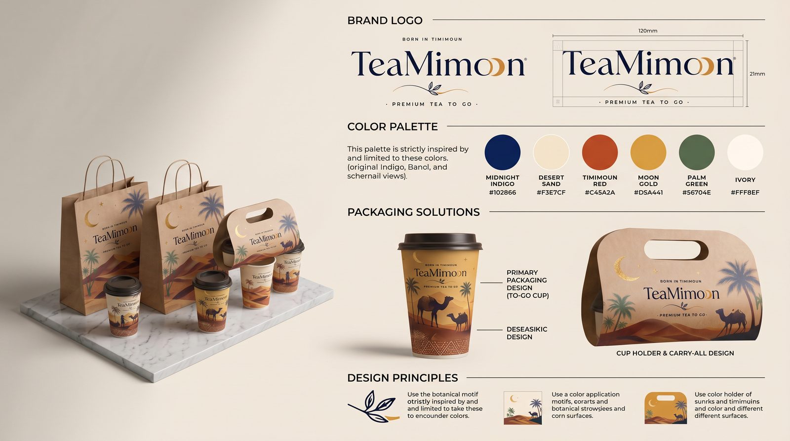
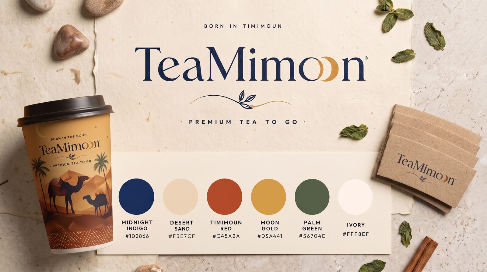
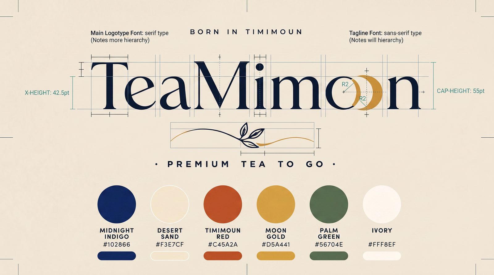
Packs and carryalls designed to be held, poured and kept.
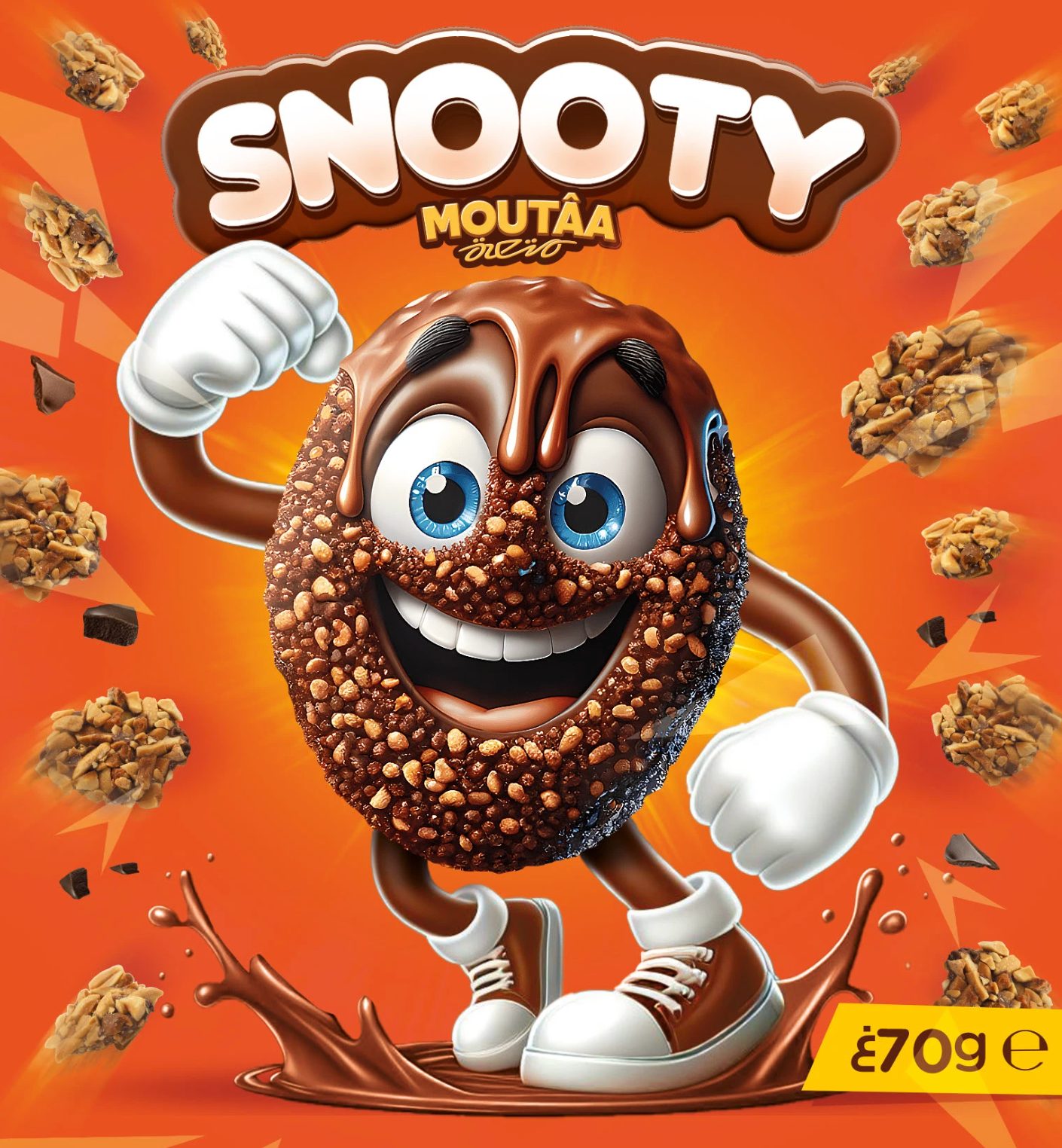
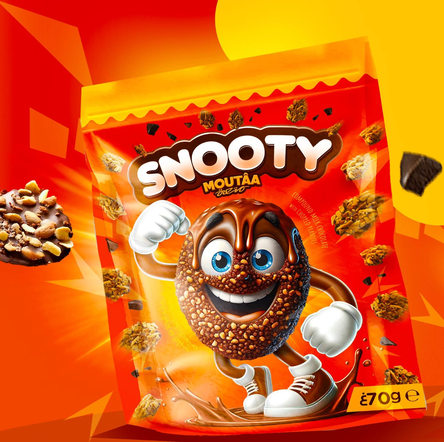
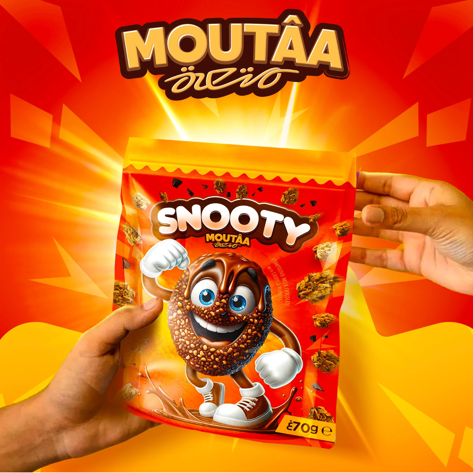
The snack that talks back — bold, playful, impossible to ignore.
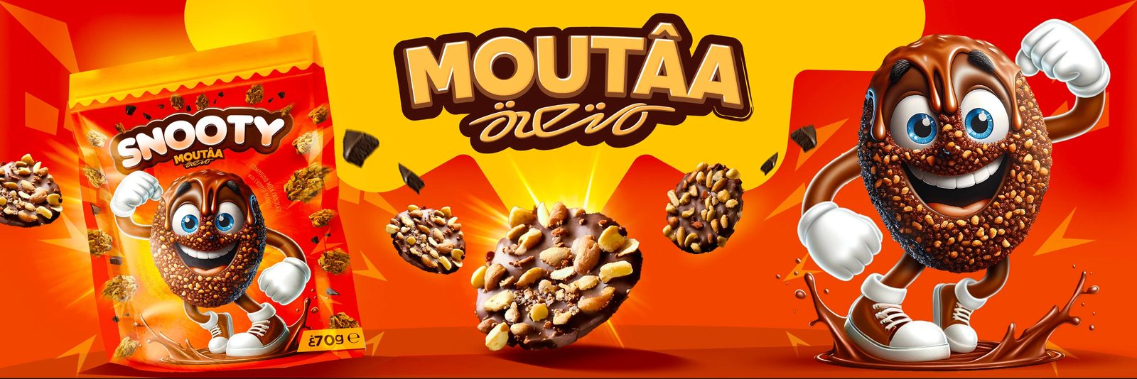
The world. Snooty lives loud: a mascot with no fear, street-level energy, colors that don't apologize.
The making. We built the brand from zero — mascot, packaging, banners and a visual world ready to make noise on the shelf.
Too bold?
Probably. That's the point.
Packaging that works as hard as the snack tastes — cover and all.
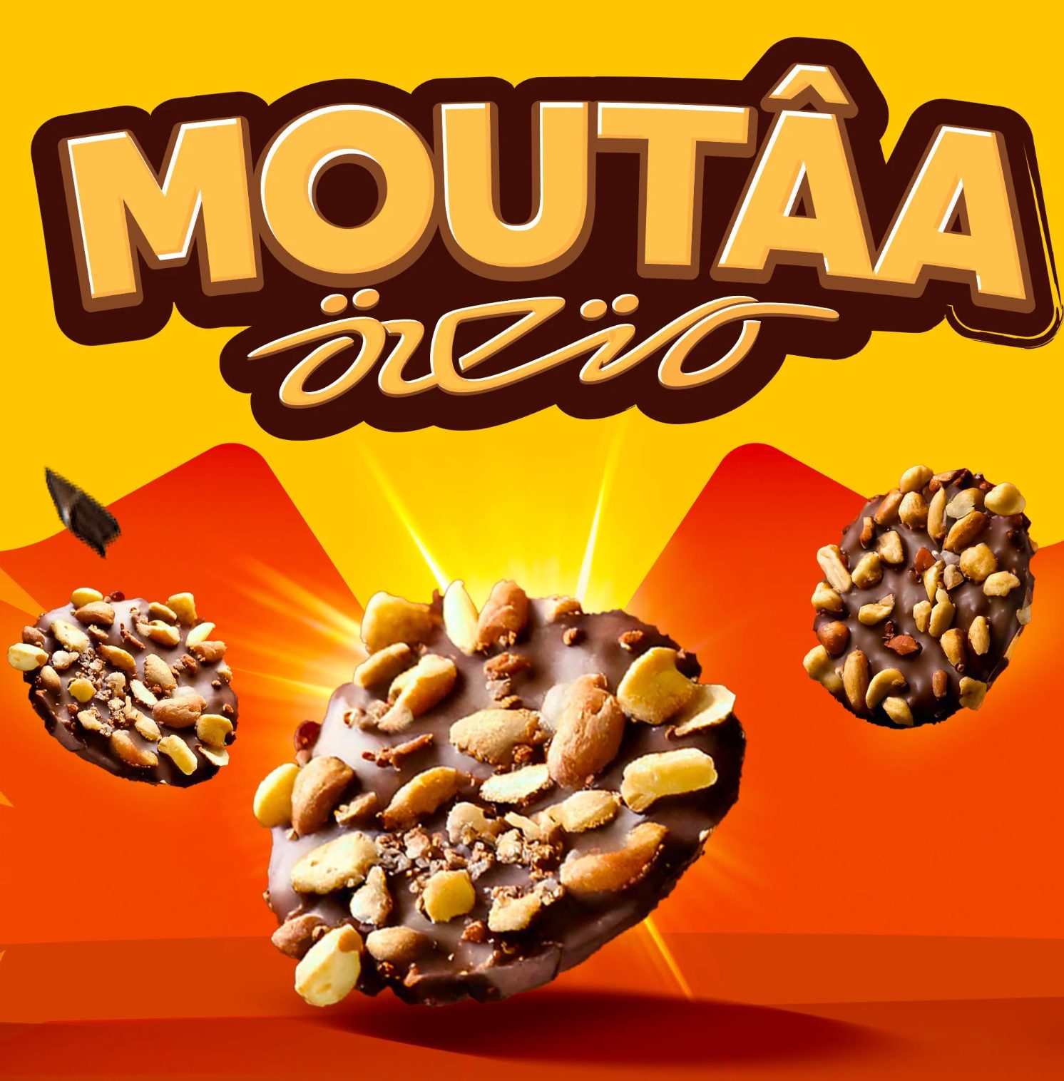
One character, endless expressions — the face of the brand and its mischief.
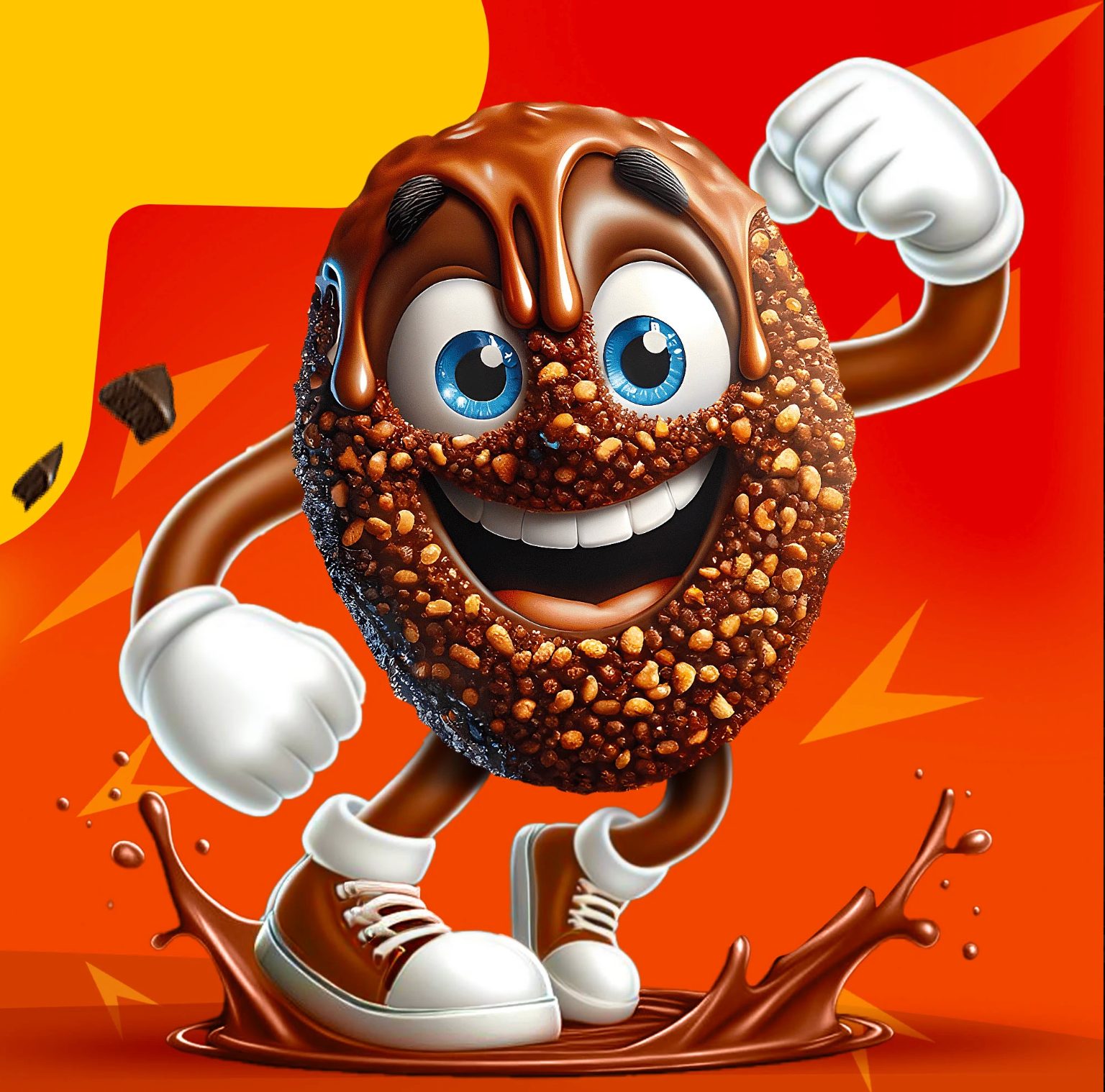
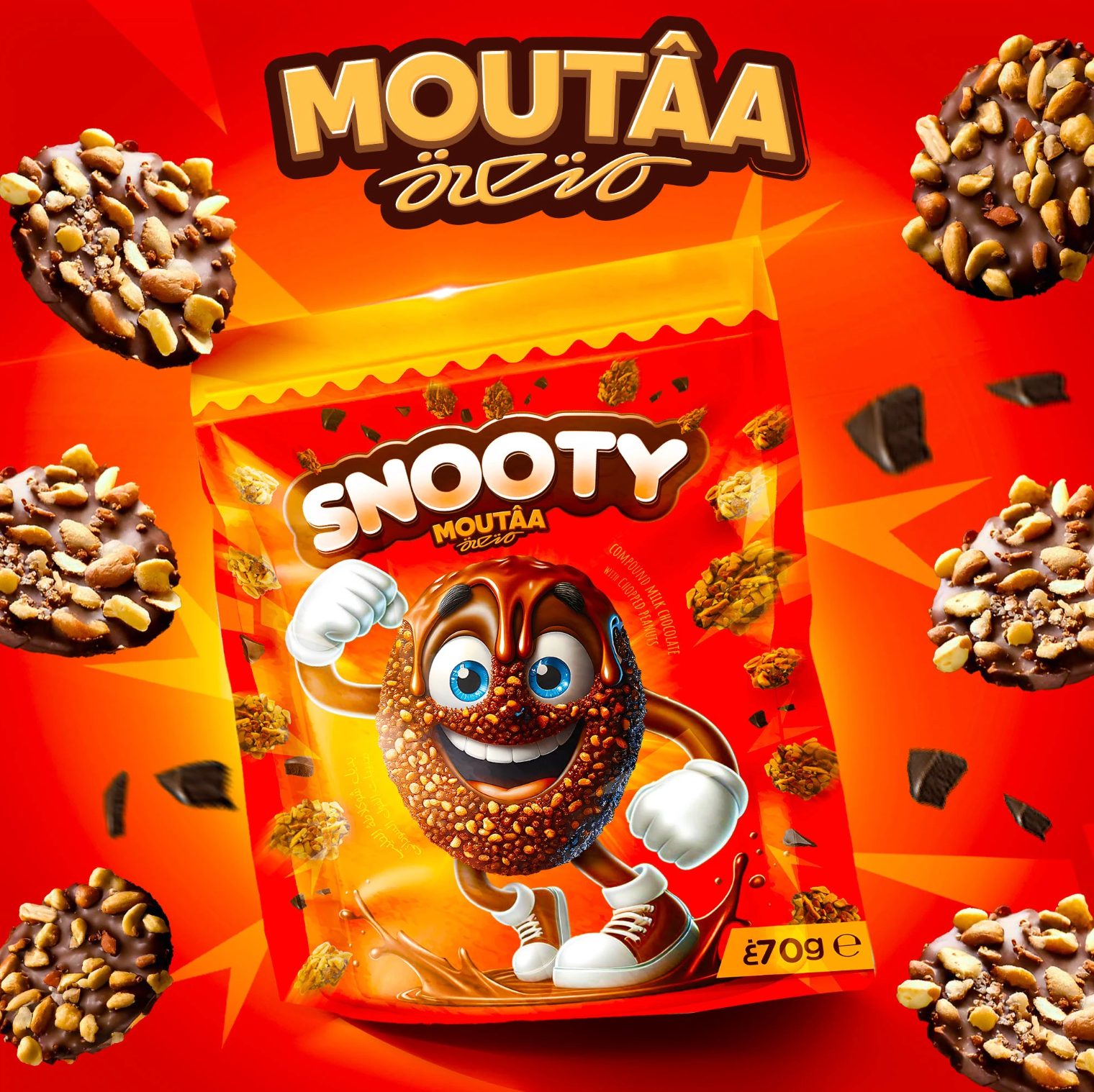
The brand stretched wide — built for shelves, screens and street-level noise.
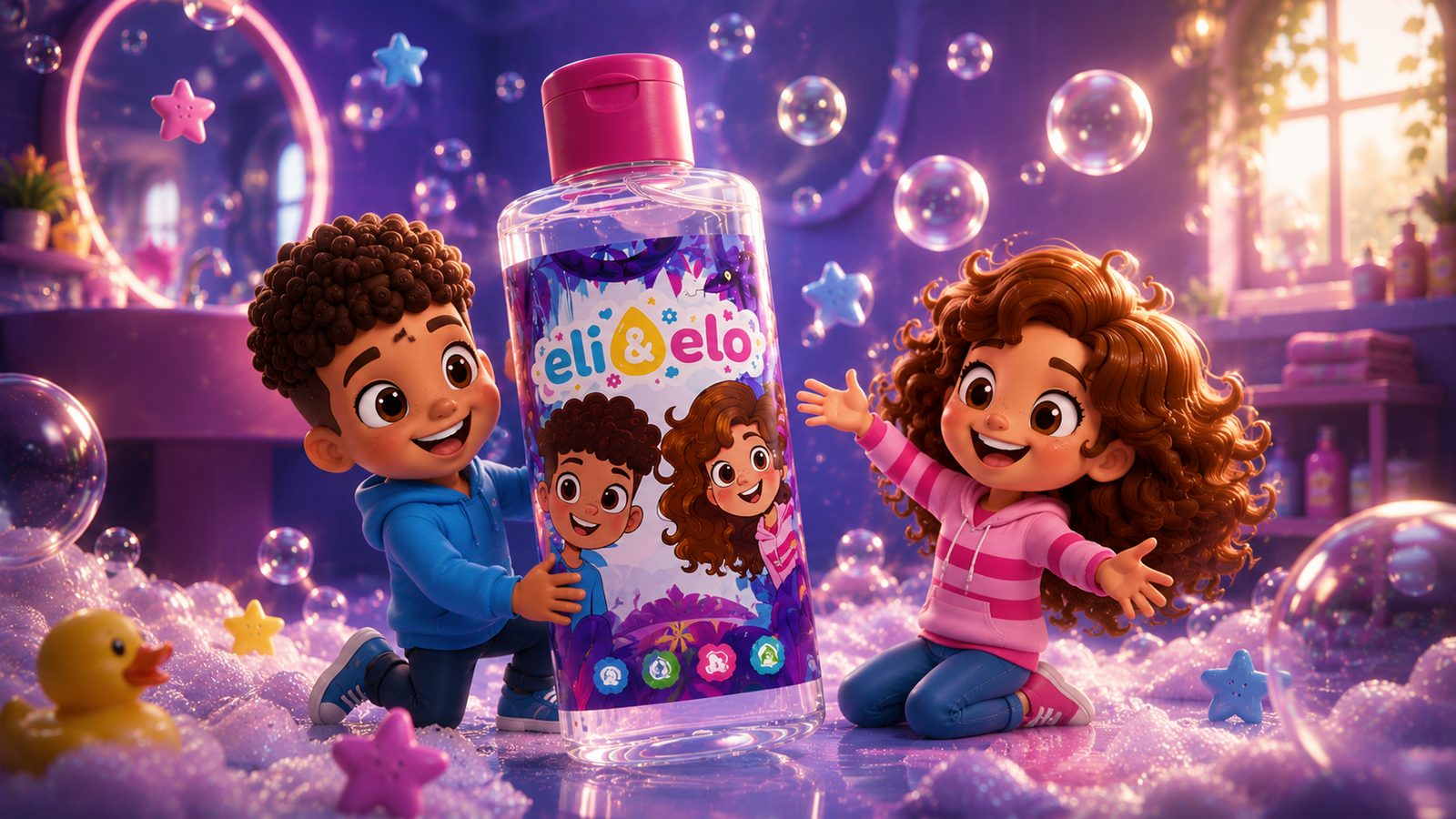
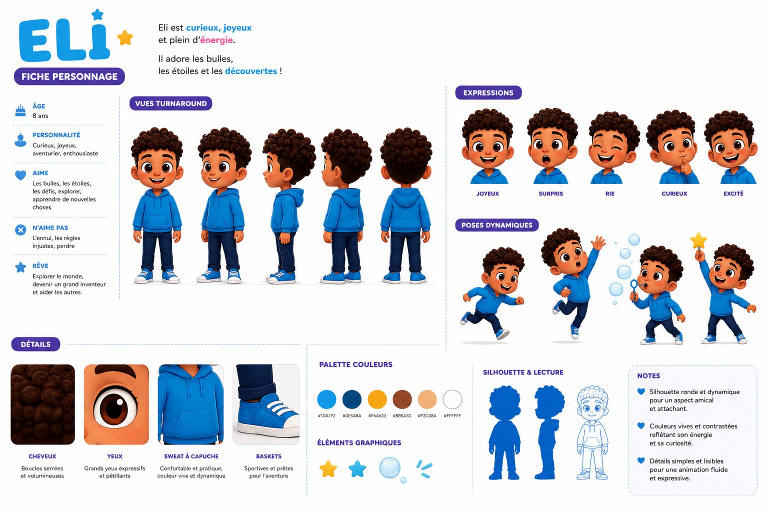
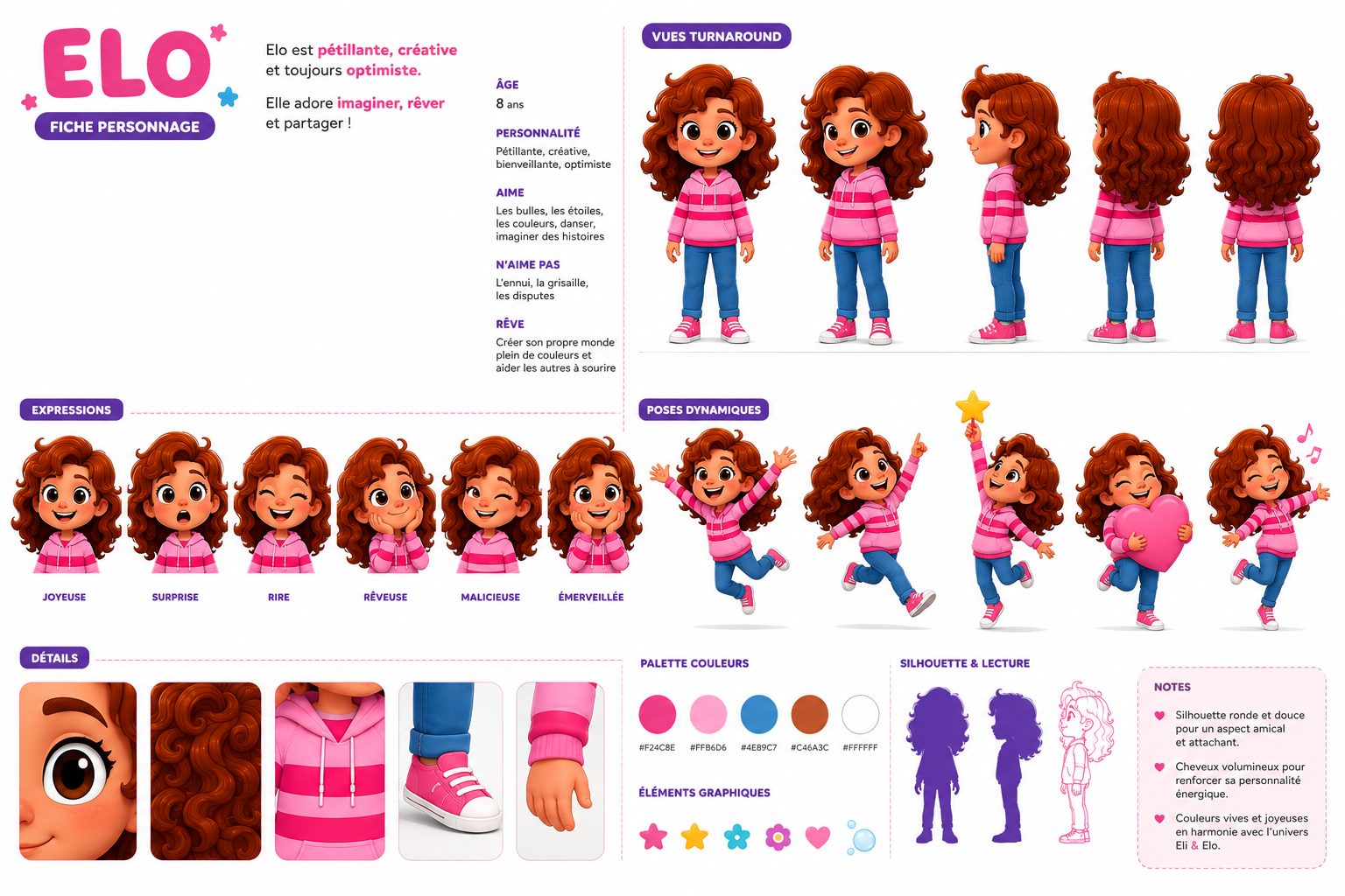
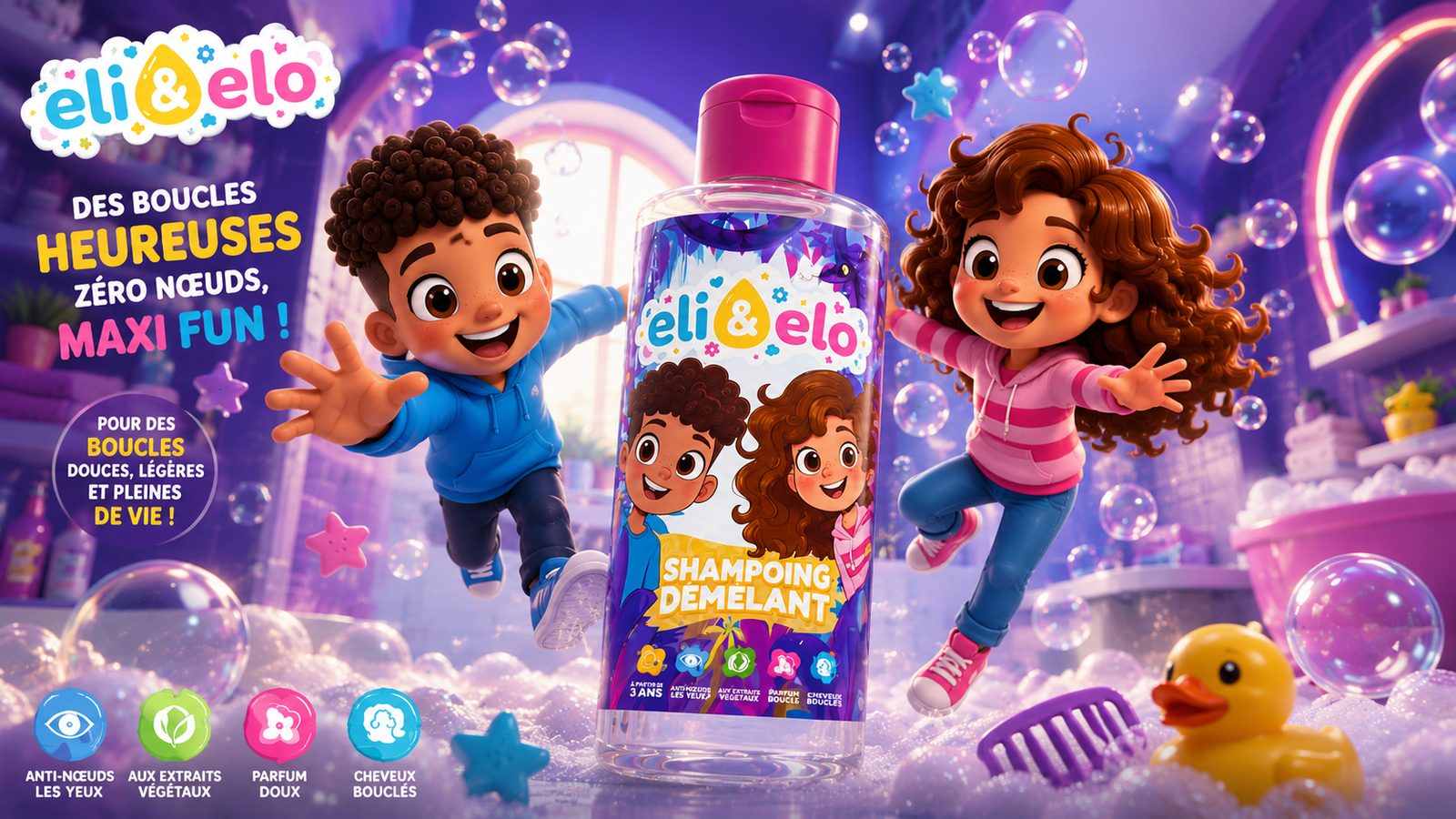
Two characters turn hair washing into a bedtime adventure — gentle formulas, joyful worlds.
The world. Eli & Elo lives in bubbles and stars — a universe that comforts parents and delights kids.
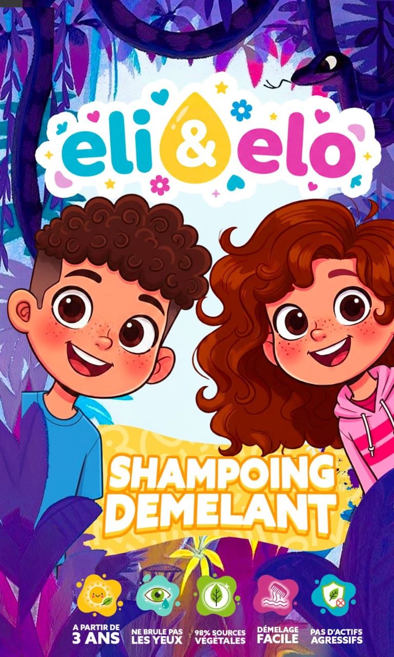
The making. We created the two characters, their worlds, the packaging and a soft identity designed to reassure and enchant.
Clean hair.
Wild imagination.
Eli, his key visual, Elo and the bubble world — side by side, as they belong.
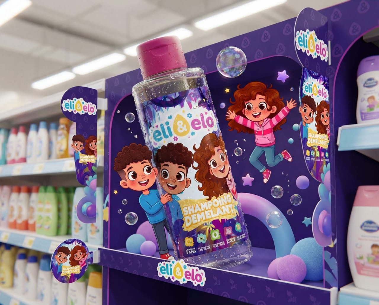
Flat, friendly and safe-looking — packaging that parents trust at a glance.
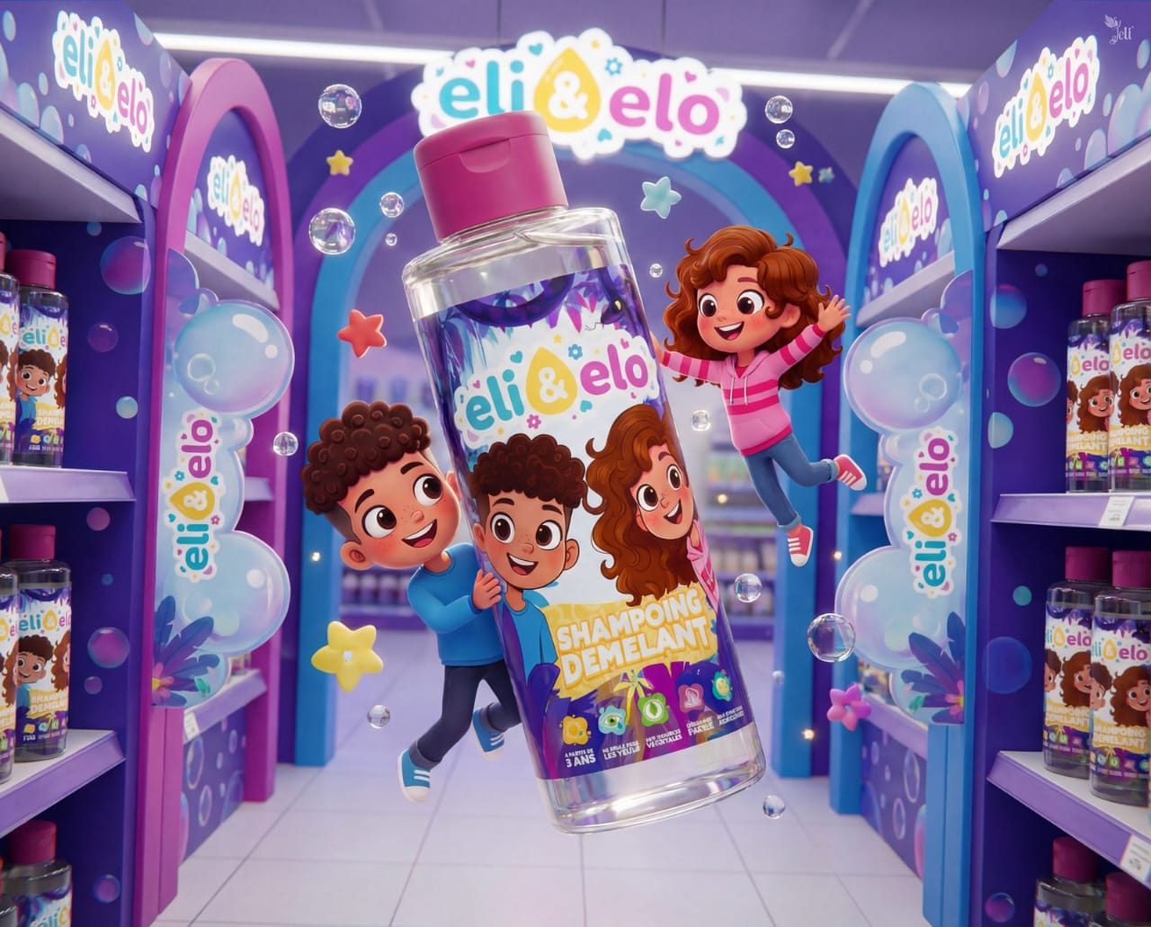
A presence that turns the baby aisle into a storybook aisle.
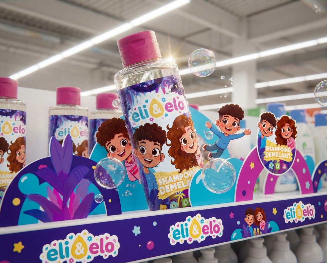
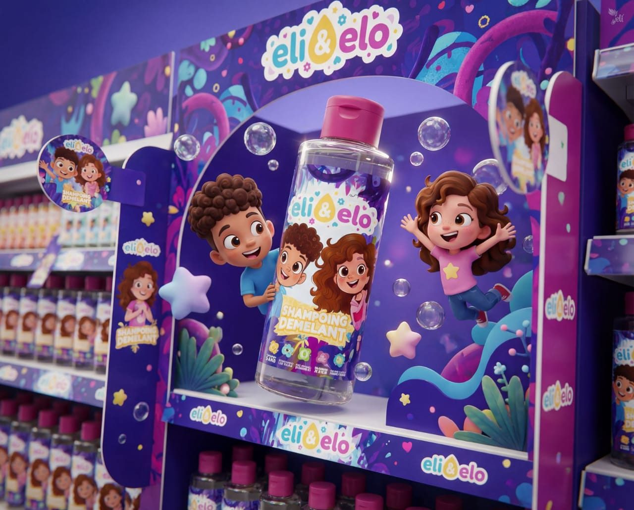
A category nobody dreams about — given the treatment it deserves.
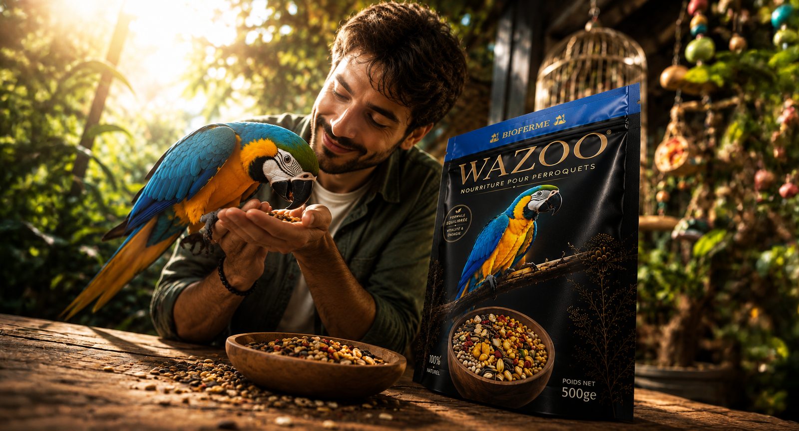
The world. Bird care treated like cosmetics: rich materials, deep tones, unexpected elegance.
The making. We crafted the identity and packaging from scratch — jars, powders, shelf presence — a premium universe where there was none.
Good enough
for the shelf.
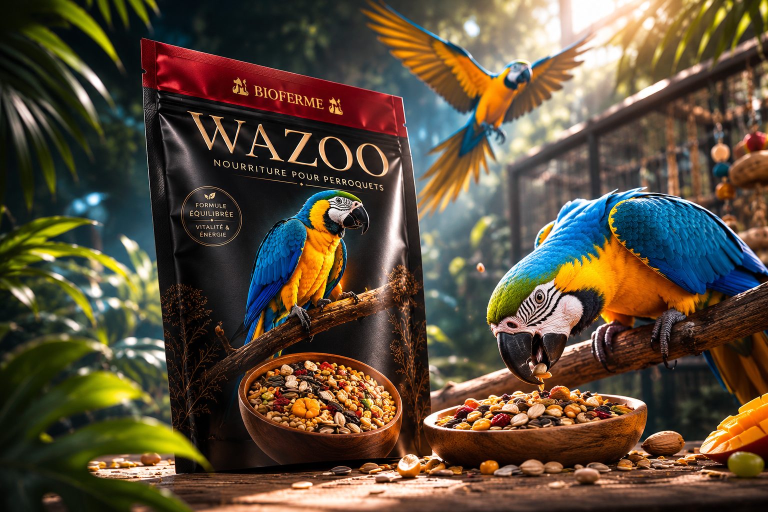
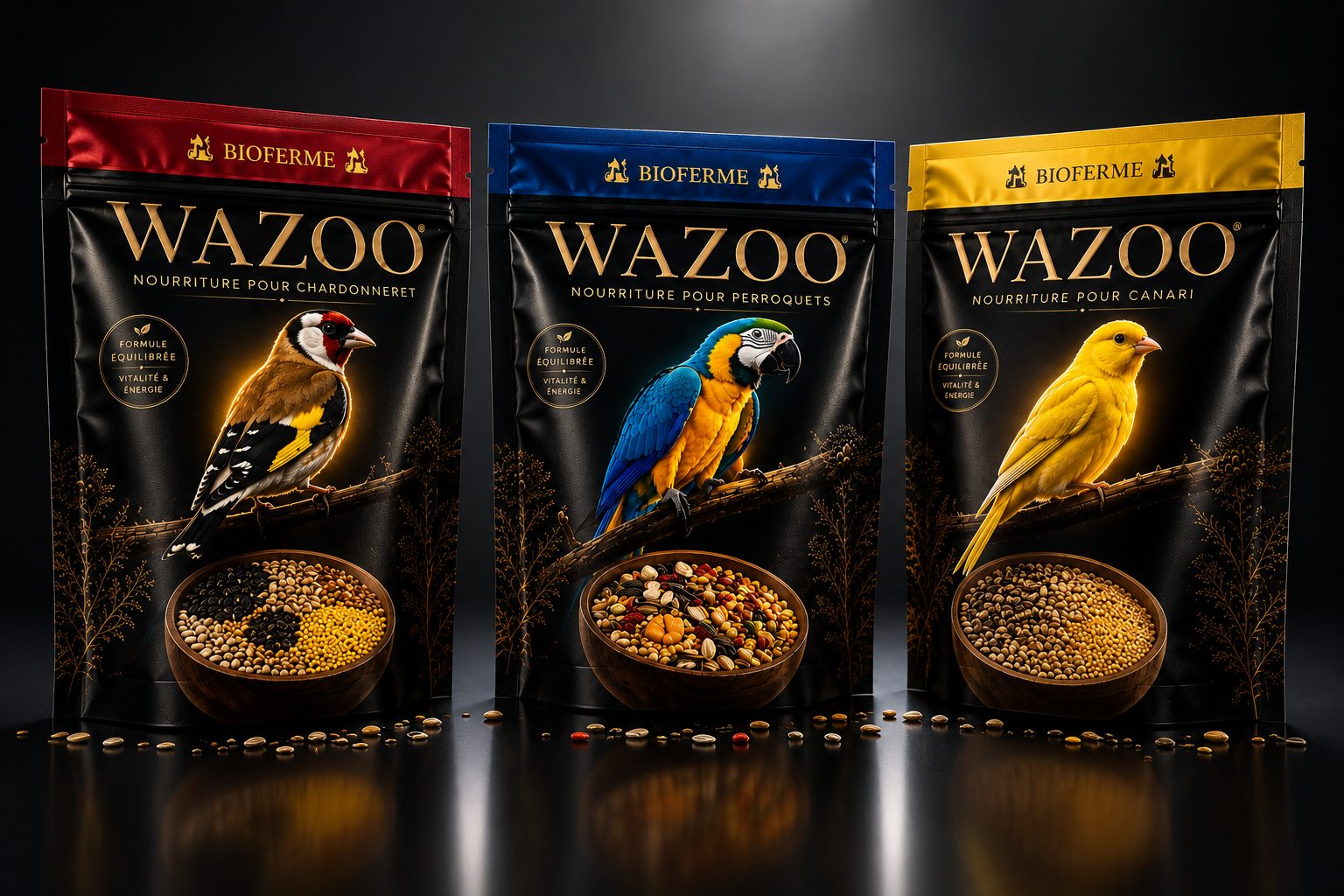
Powders and jars designed to feel as good as they look — cover included.
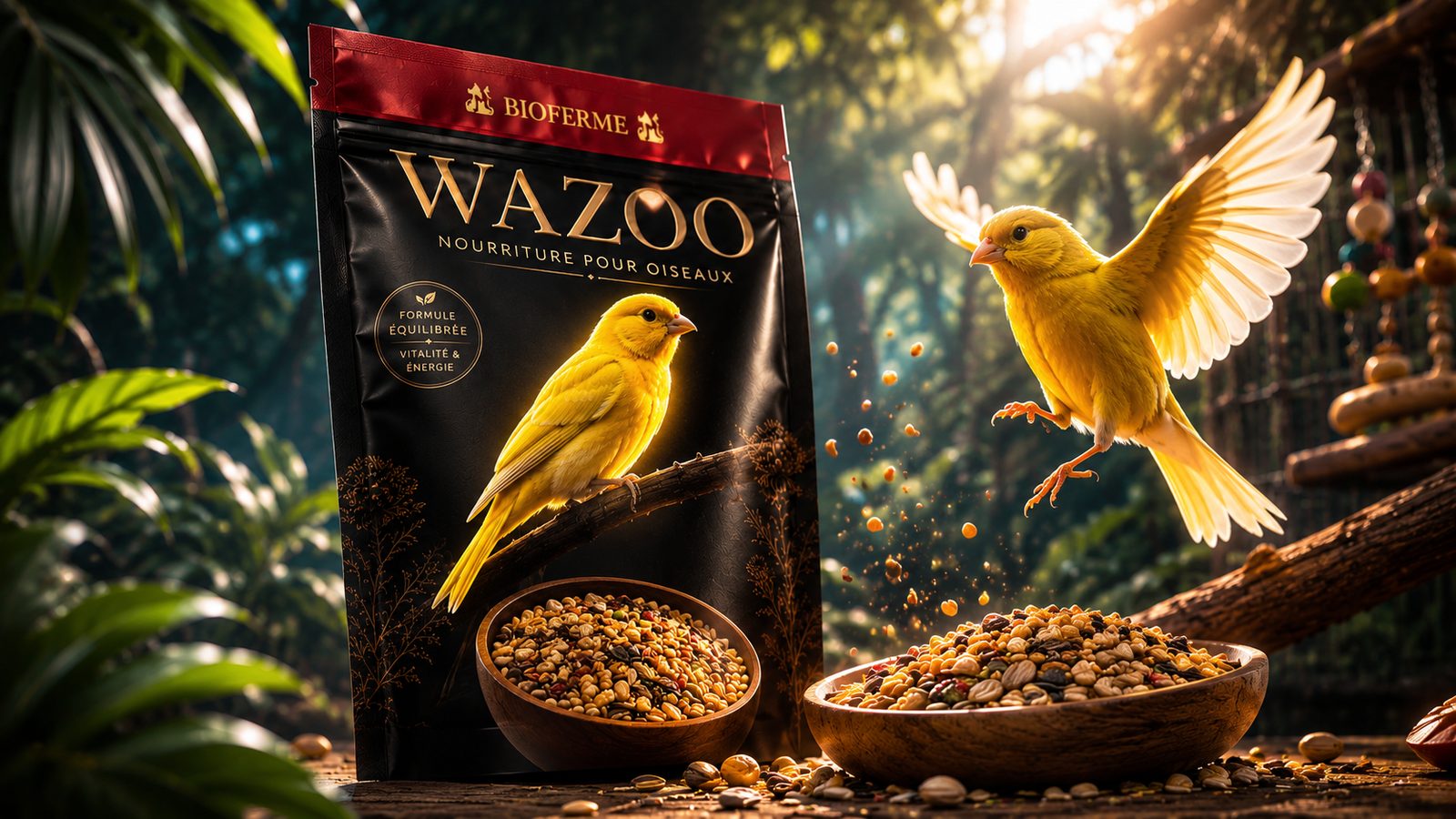
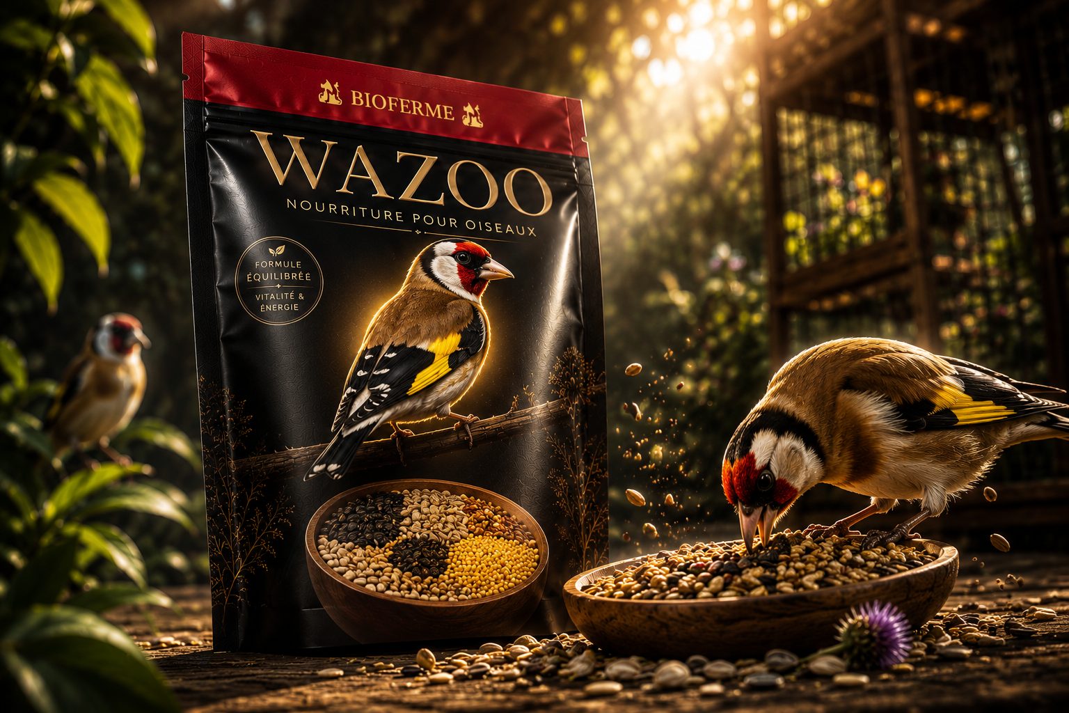
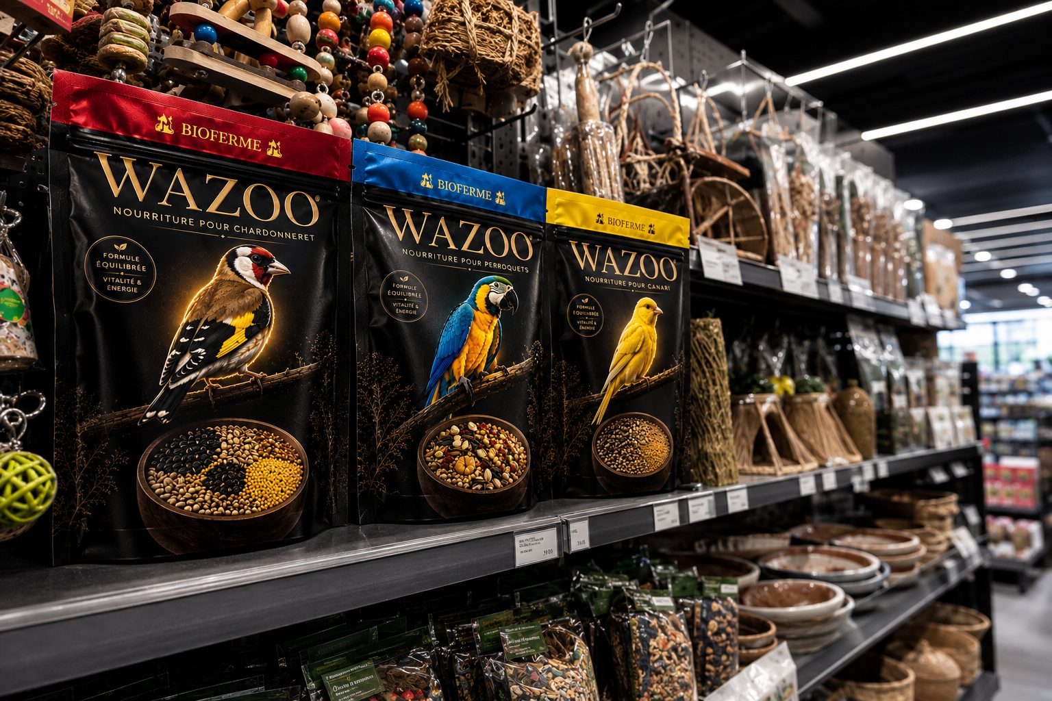
A shelf presence that breaks the category's visual silence.
Texture, light and motion — the product living at its most beautiful.
A honey film made entirely by generative AI — no camera, no studio, no crew.
The world. Golden light, slow macro, liquid amber — the poetry of honey, generated frame by frame.
The making. Every shot crafted with generative tools: art direction, motion and sound, all produced in-house at the speed of an idea.
Frames from the film — every one generated, none captured.
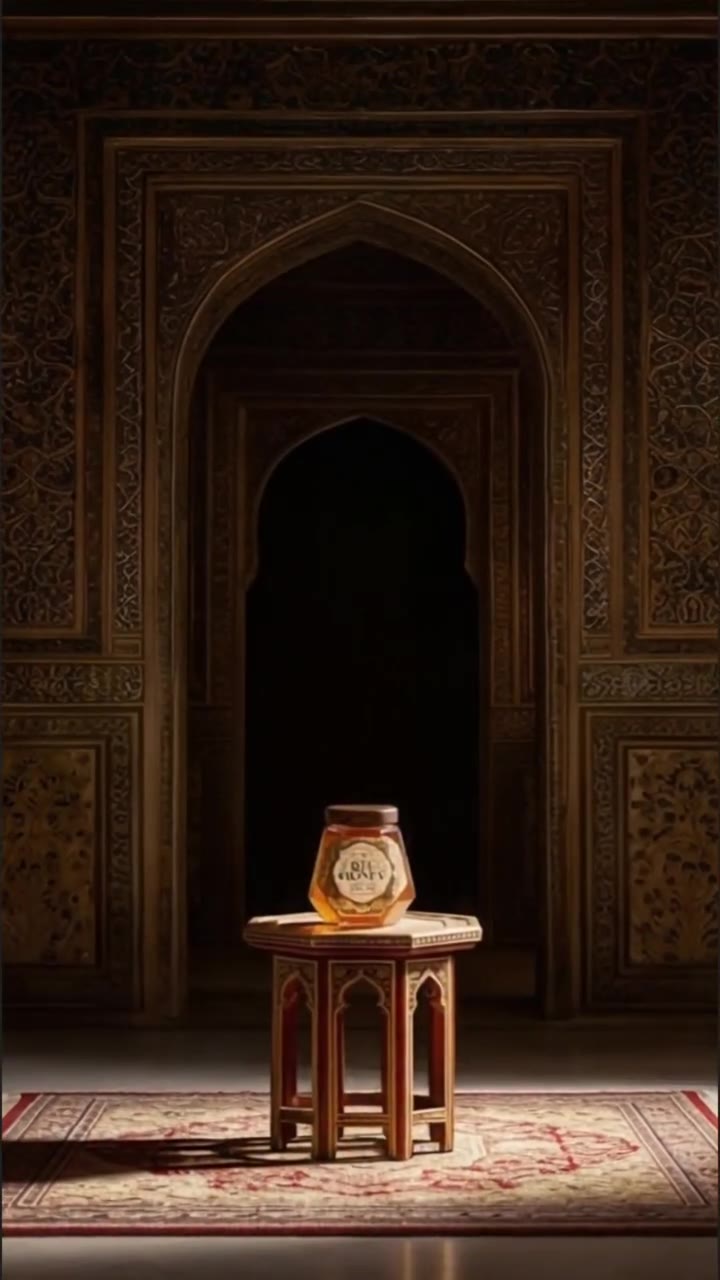
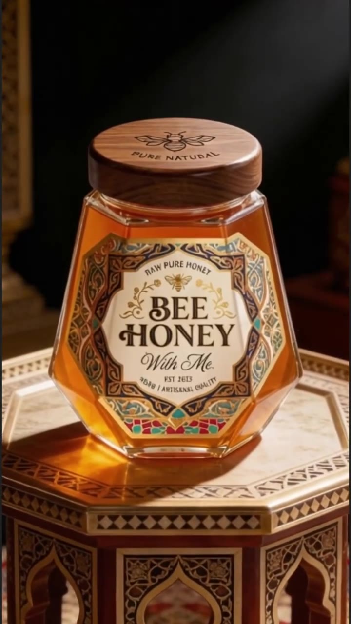
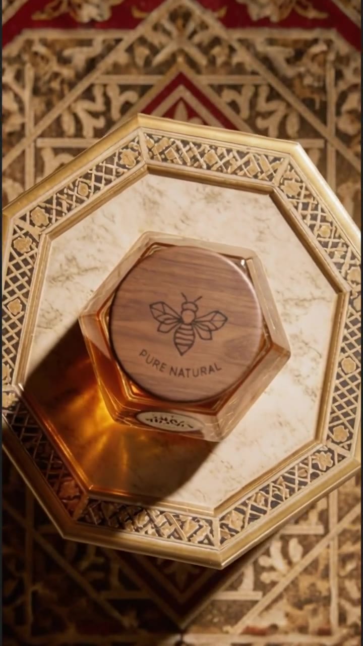
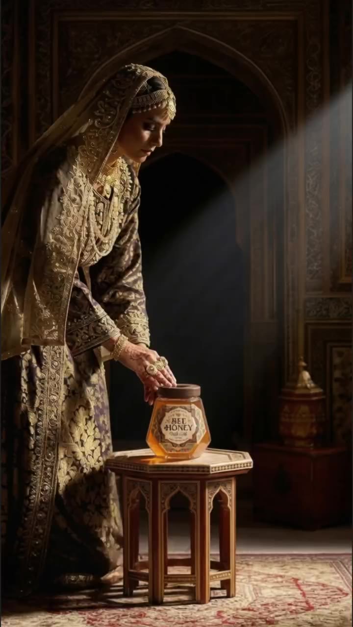
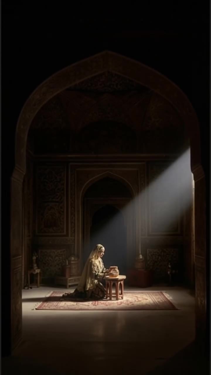
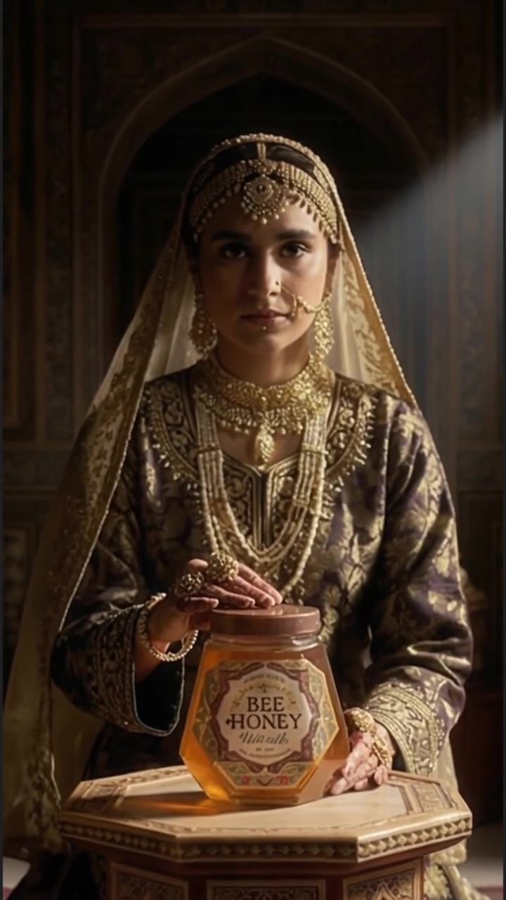
18 seconds of pure generative cinema. Sound on.
Un essuie-tout pensé pour les petits accidents et les grands moments dehors : pique-nique, plage, randonnée, camping et road trips.
A compact paper towel brand made for the moments that happen outside.
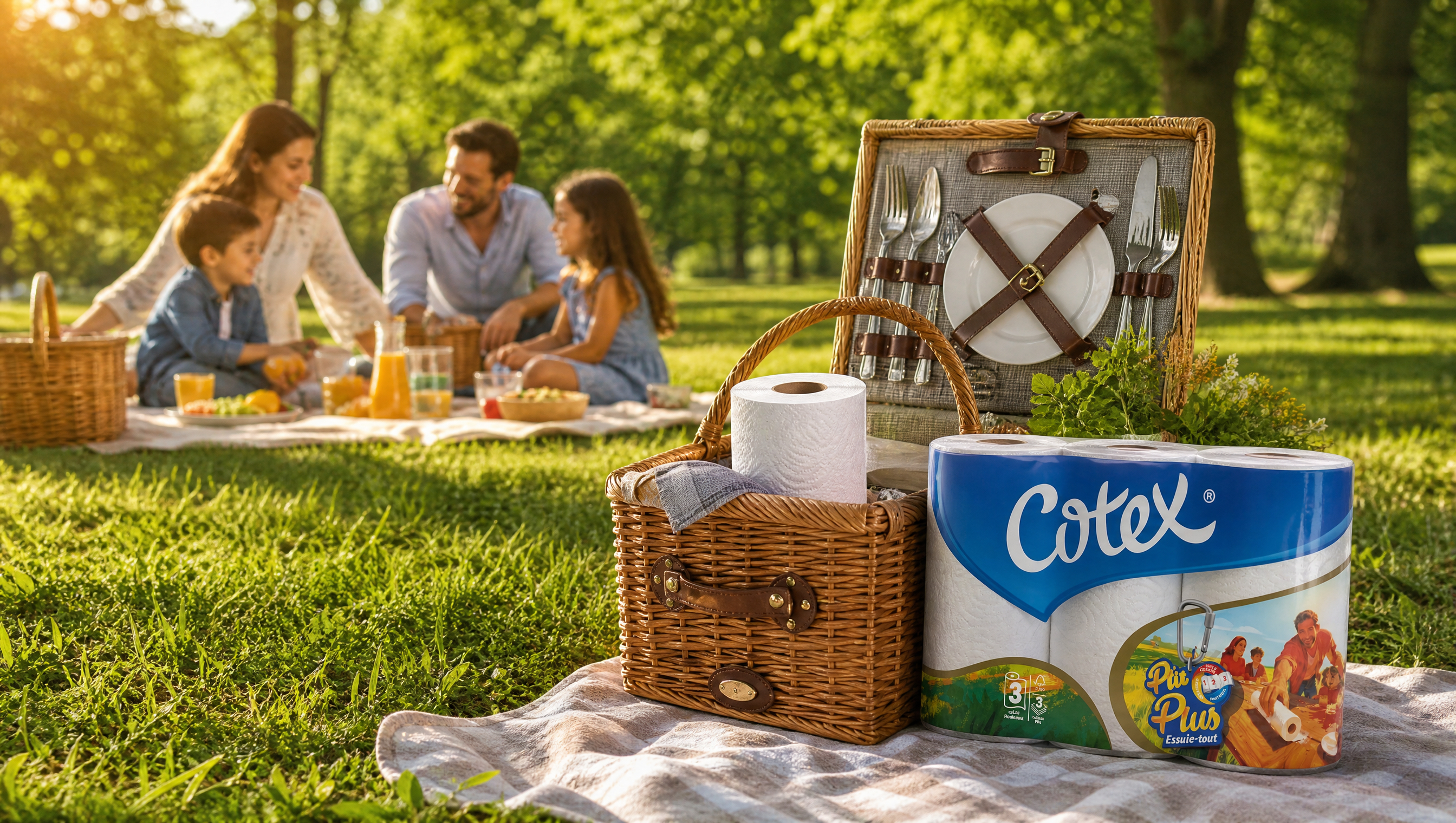
The world. P'tit Plus turns everyday mishaps into shared memories: bright packs, simple gestures and a visual language built for movement.
The making. We shaped the packaging and outdoor campaign as one system, so the product remains recognizable from the shelf to the beach.
Ready for the little accidents.
Made for the big moments.
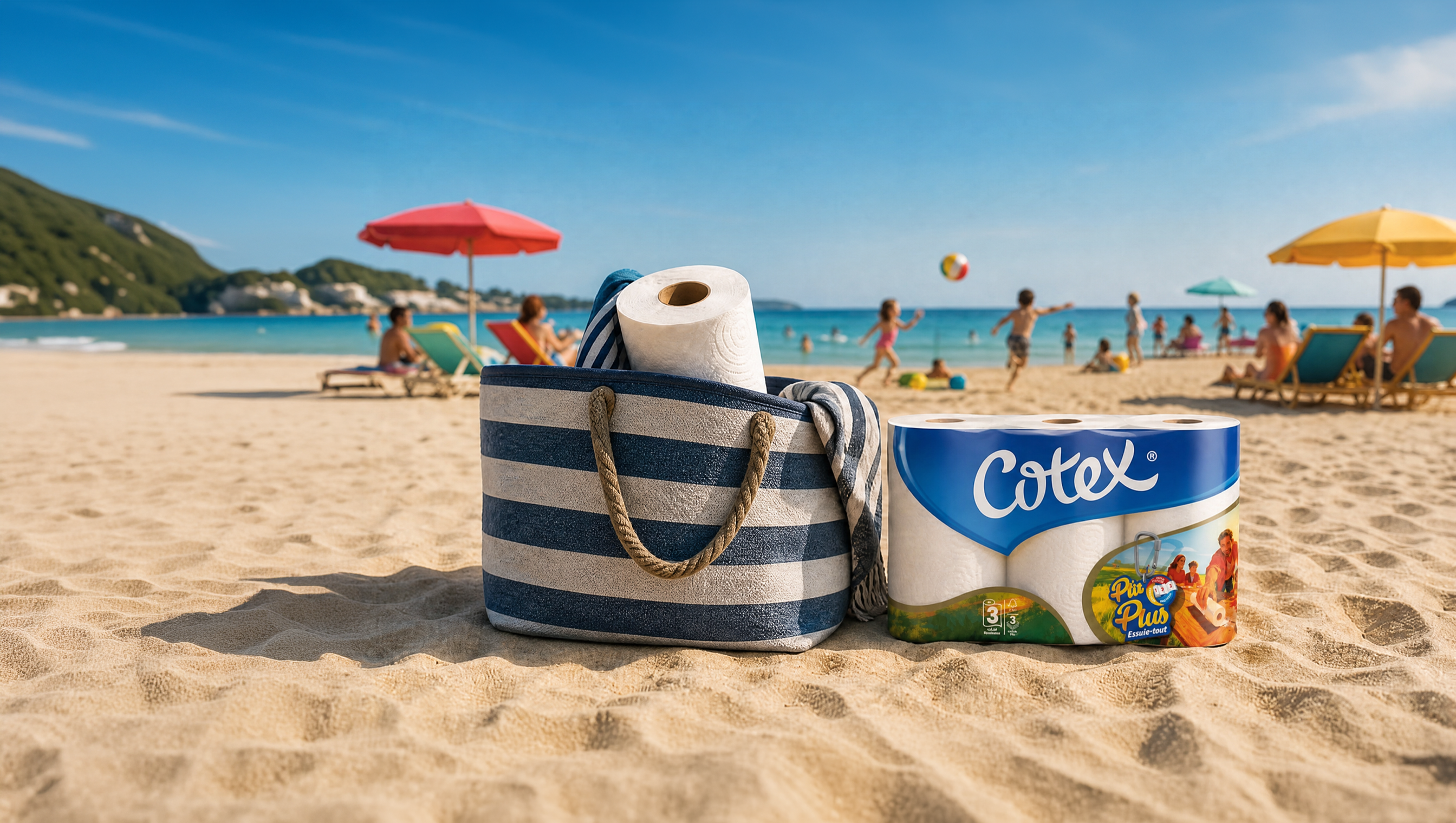
Two key visuals that put P'tit Plus into the real moments people remember.
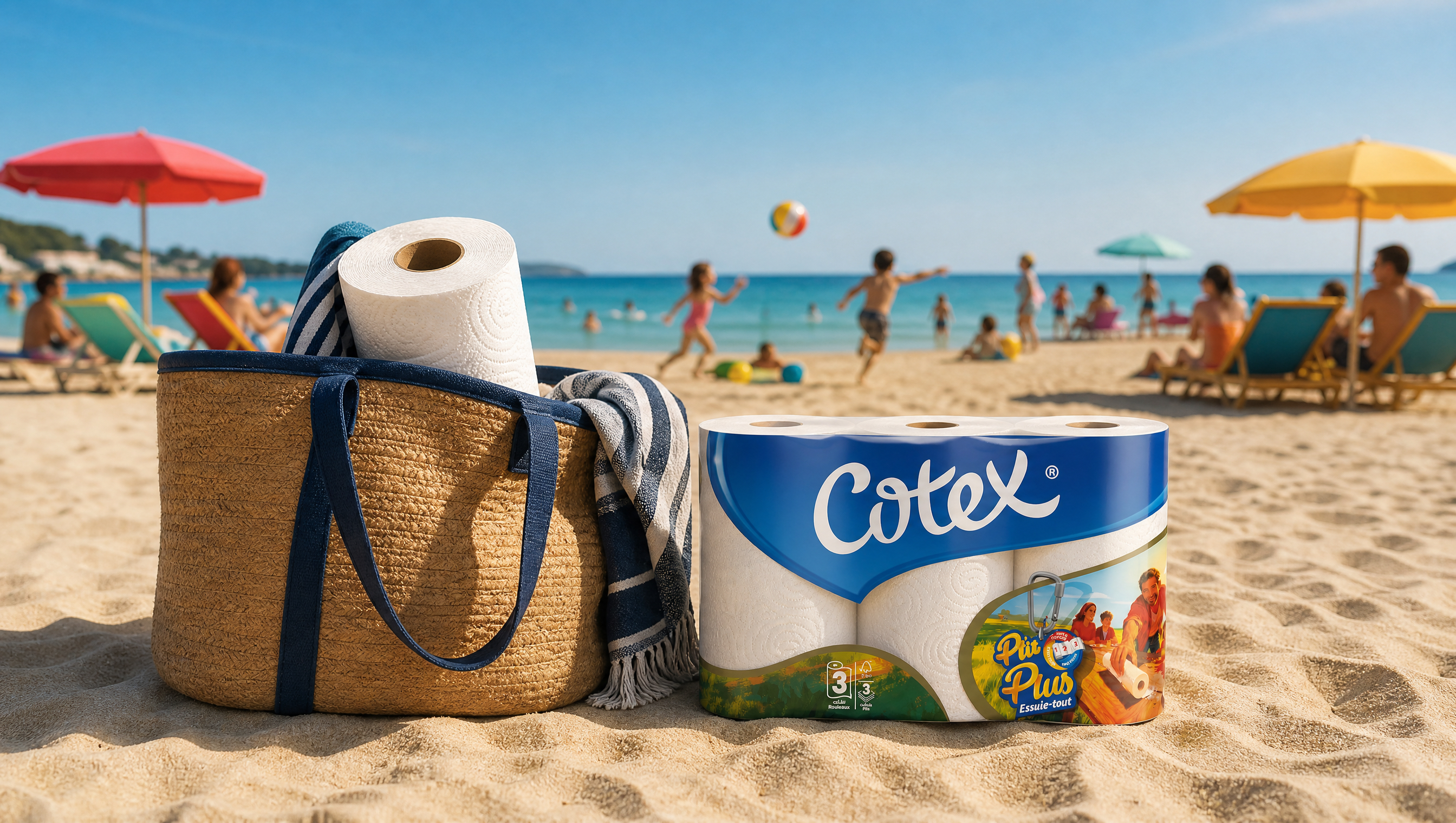
A compact pack system designed to stay visible, useful and easy to carry.
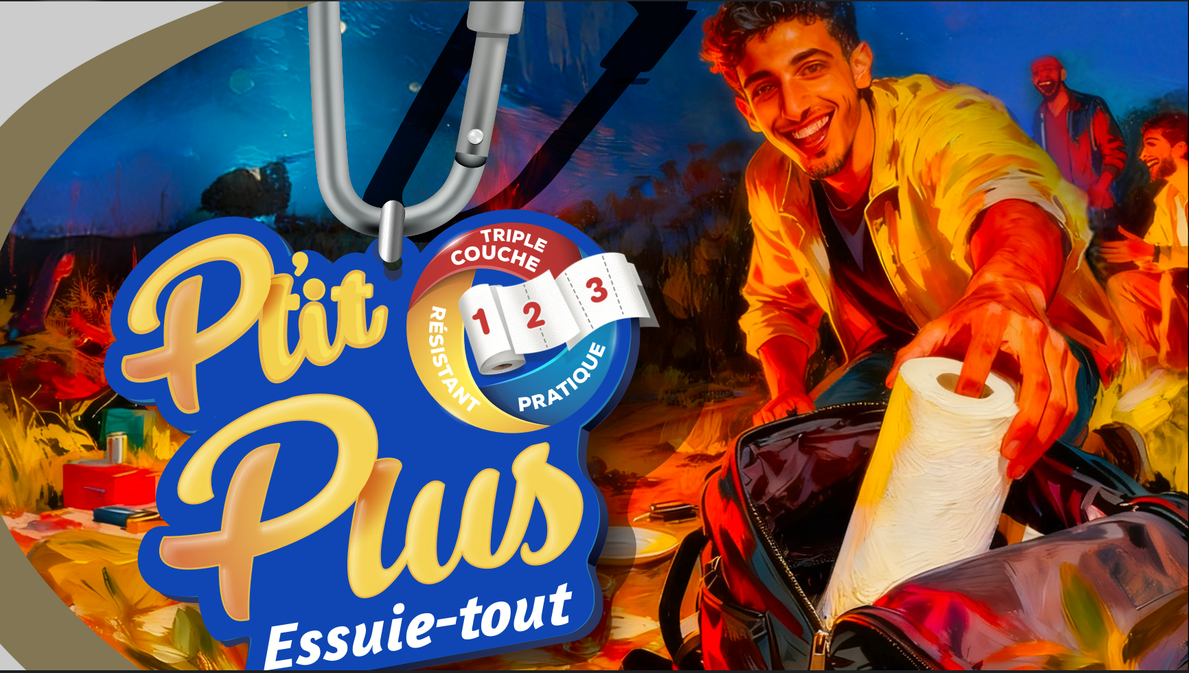
A flexible image library for picnic tables, open roads and days by the water.
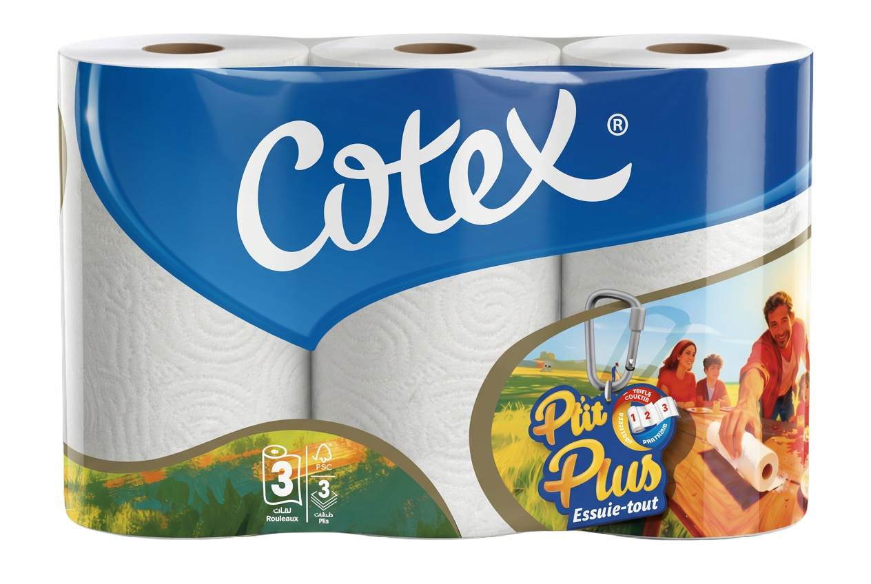
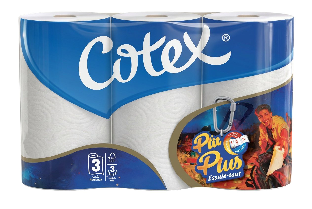
The color system keeps the brand easy to spot and easy to remember.
The Other Side is an independent studio where strategy, design and film collide — human vision, AI speed, real craft.
We don't make pretty things.
We make things people feel.
Insight, positioning — the idea before the image.
Identity systems built to be unmistakable.
Design that owns the shelf.
Cinematic stories, AI-accelerated.
Human vision.
AI speed. Real hands.
One studio, three worlds. The judgment of people, the pace of machines, the finish only hands can give.
This is an indicative simulation based on 2025 agency market rates. The final quote may be adjusted to your brief and project complexity.
Indicative rates: 1 USD ≈ 0.92 EUR · 1 USD ≈ 138 DZD